Apr.22.2018 redesign of Apple.com.
Home:
The top navigation (or nav) links like 'mac', 'iphone', 'ipad' (and other idevices) now sports SVG icons. It is a custom headroom component with a soft shadow (dark blue) optimized for light-grayish backgrounds. A '3D' or embossed look for the down CSS style is created for a flat 2.0 or flat+ design (flat style with minimal depth ques).
Footer:
This has all of the necessary starting links and info. Not all of the routes are working, but the relative ones to the main nav are. Here a templated style is chosen VS tweaking per page. The background has transparency so it can have more variety based on the underlying page. This challenges the readability so a variety of font and div shadows are used to maintain visibility per page or color theme.
The main off links are light blue and flat styled, but the host of necessary links required more colors for separation. In this case, a slight and hard shadow. The text has a heavy blurred shadow and indents for the sub links. It is assembled kind of like the inverse of material theory to maintain some flatness (while retaining clarity).
Notice again the footer is currently set to 'Support' here because this is a static templated footer.
Mac:
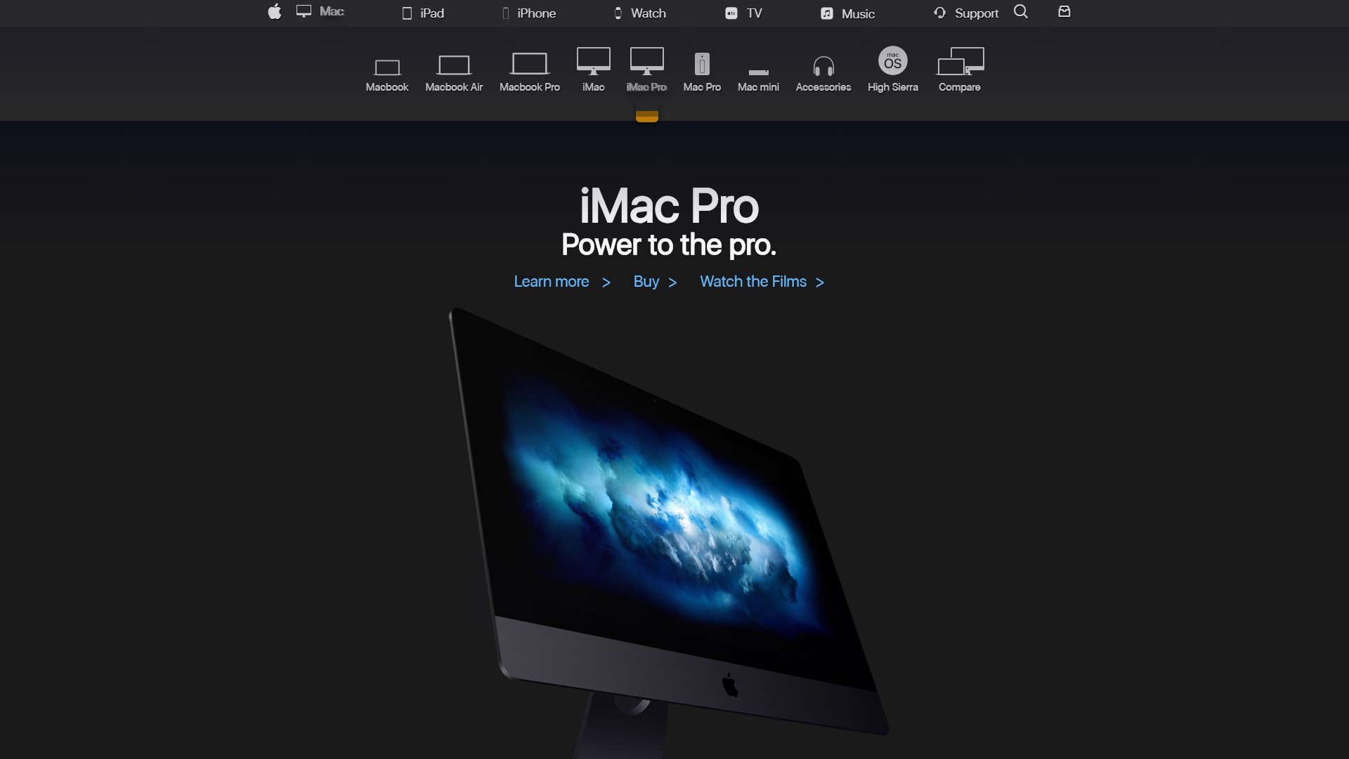
Here we get the first taste of the scrolling sub nav. The dark colors make the nav shadow's gradient a bit jarring since it is optimized for light colors. It is possible to tweak this shadow, not currently worth the time. Browsers in the not-to-distant future may be upgraded to support 16-bit or even 32-bit color. This is entirely possible since browsers already handle gradients different and some are smoother or have better color interpolation (like Chrome).
iPad:
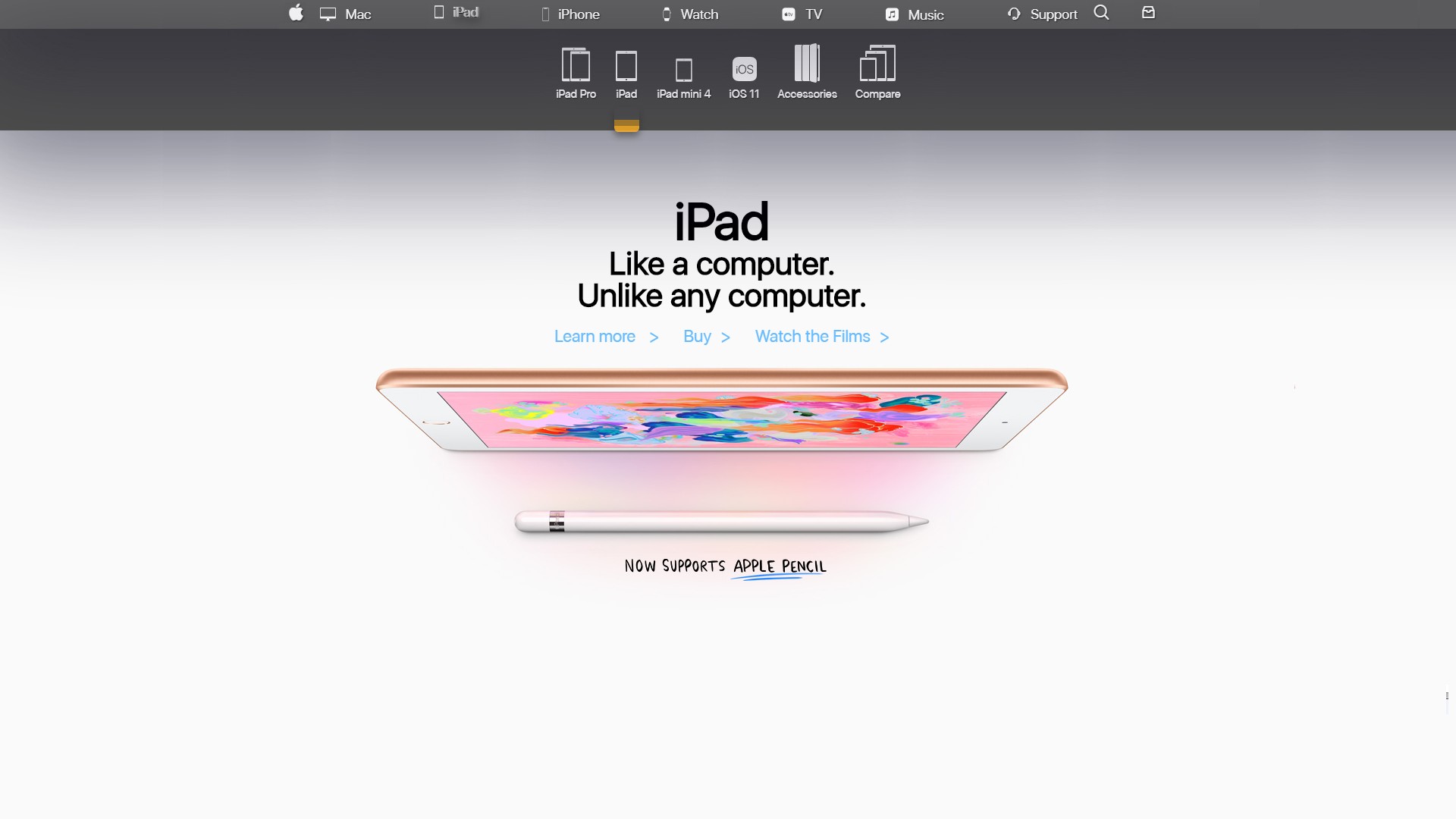
That big gradient is back to looking smooth again here thanks to the light background. Also take note of the golden pop-up tabs or 'bookmarks' on the sub nav. These are just styled divs to maintain load speed. They replaced the tiny orange words 'New' from Apple.com. This 'New' design choice never really made sense to me. A gold theme is a metallic accent in the mind, so you can pretty much add it to everything and maintain a solid consistency.
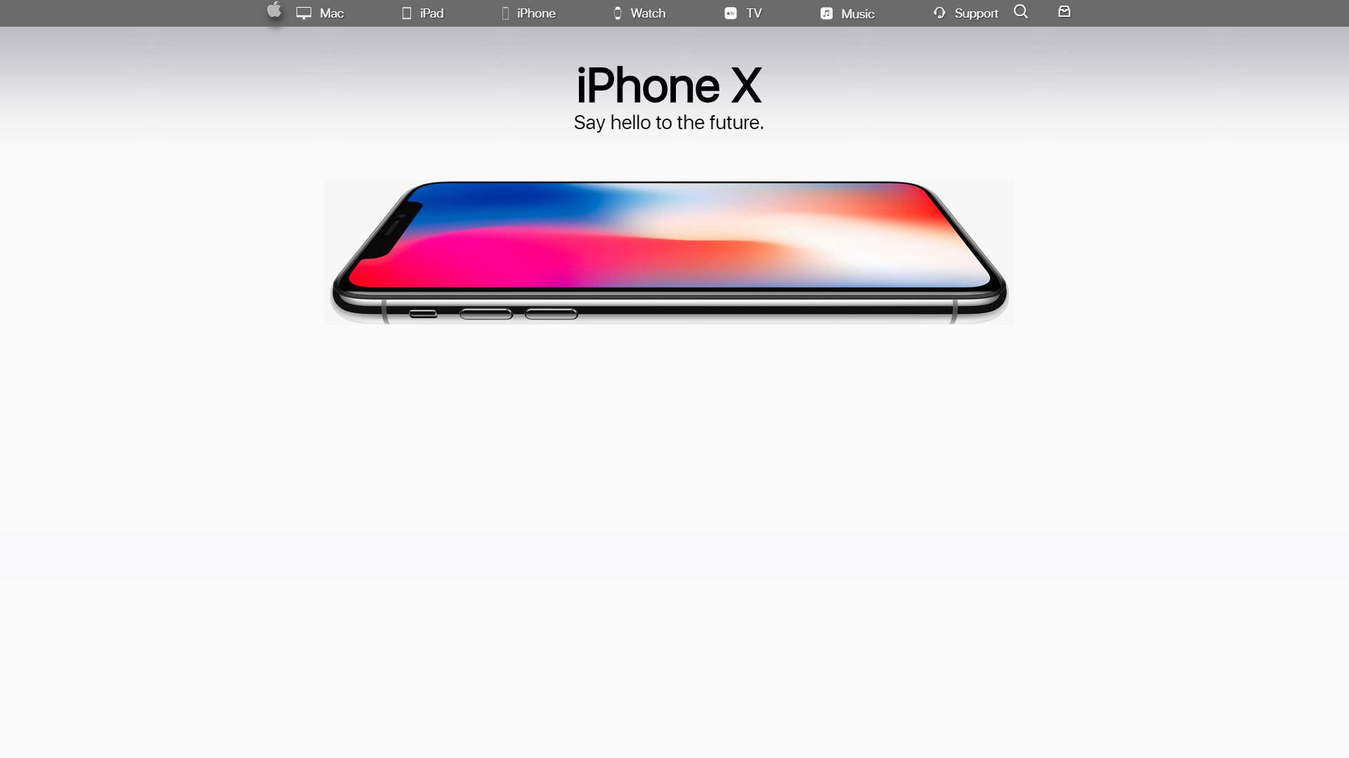
iPhone:
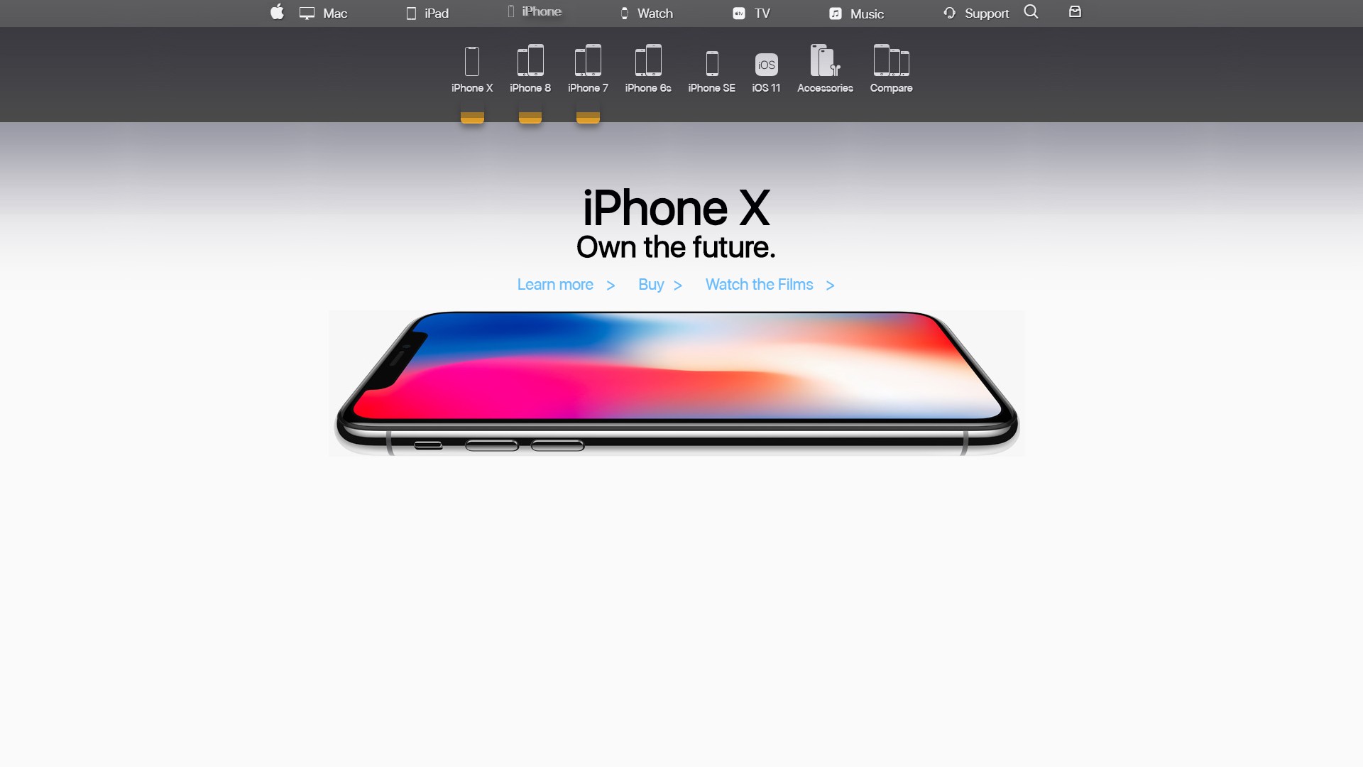
The original tag-line from the rehashed 'Say Hello to The Future' was changed to 'Own the Future'. This works since we're progressing towards the user purchasing the product from the original pitch (plus, it is less wordy). This helps visually balance the text more with the added type from links.
We can also see how well the multiple golden tabs work vs multiple 'New'. Simply having 'New' over and over in orange drains the 'Newishness'. A sleek tab with some pop appears more organized and clean, especially when placed against other text from the main and sub navs.
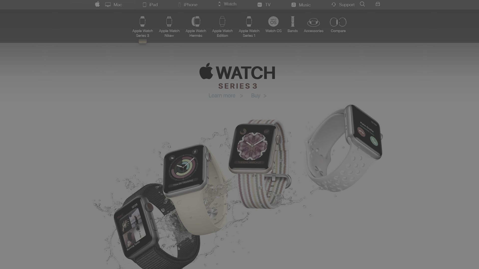
Watch:
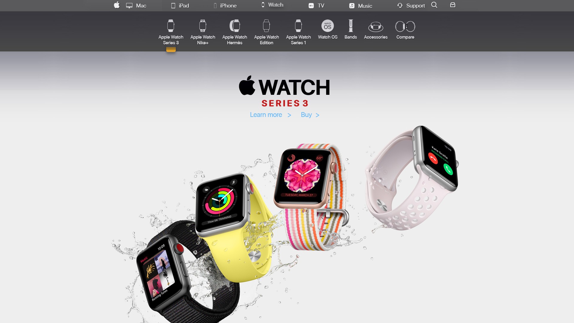
This is the first page where the main logo image (png) is replaced with fonts and the reused apple icon. 'SERIES 3' is also replaced with text. Font rendering is slightly off per browser platform, but it is not bad. A better choice may be to replace the logo with an additional svg if such precision over load speed is needed.
TV:
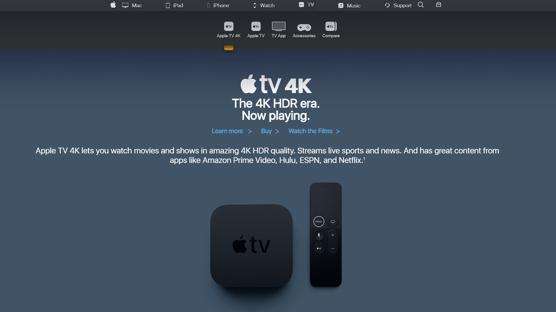
The Apple 4k TV logo is replaced for a second time with fonts and icons. Once again, it is slightly off, but even closer than the 'SERIES 3' section of the Apple Watch page. The original city scape banner image below the sub nav is now gone because it breaks the templated style of the other pages (and also add clutter). One option to consider is recycling the city scape image by having it funnel down into the 4k box (like by editing in Photoshop or JavaScript scroll animation). Your eyes should be lead downward to more content and selling the product 'in action' instead of just decorating the page.
Music:
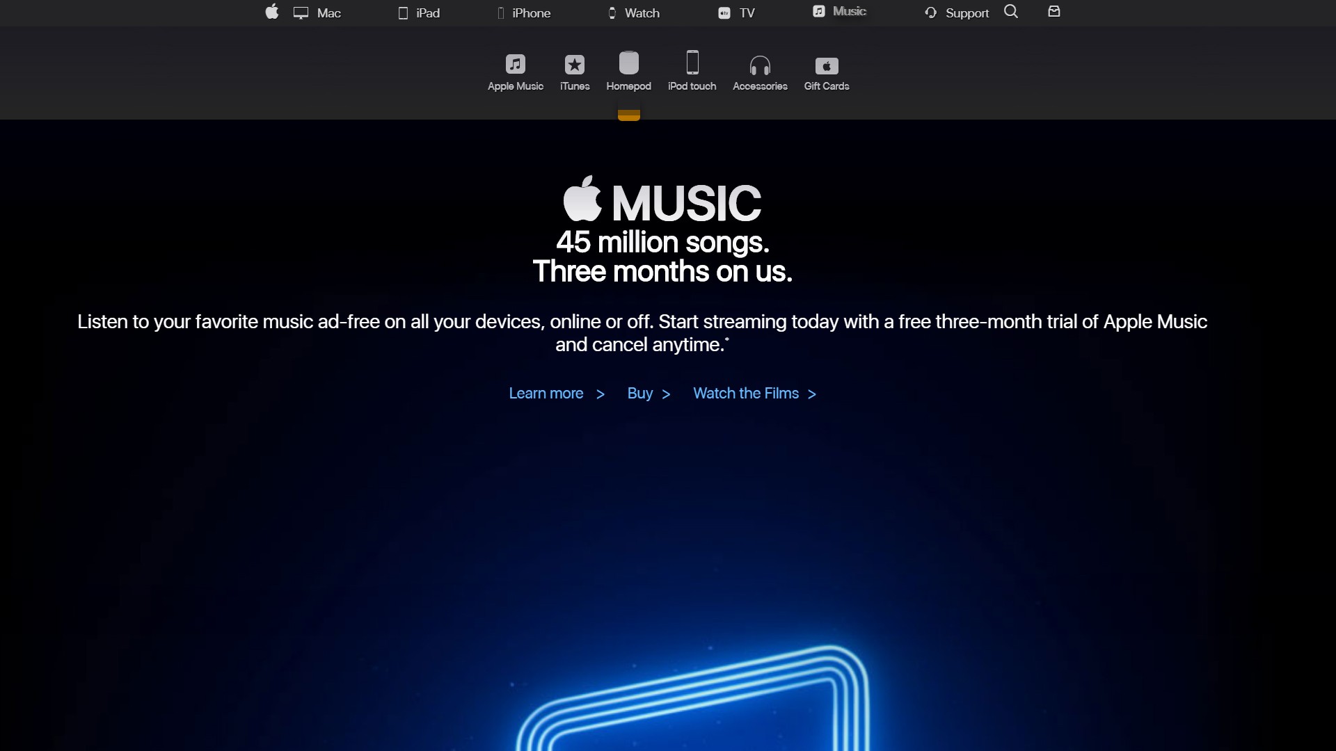
Not a fan of the black. This page breaks the style guide worse than Apple TV. The original animating video with the fallback png on fail are in and working. It is a shame how much the video (and png) are outside the initial frame on a standard 1080p screen. Would prefer a similar treatment as the other pages, but left this black background in because it blends with the existing video. Plus cinema themes are generally black (screen matting and dark theatres) so this style somewhat works under the umbrella of entertainment media.
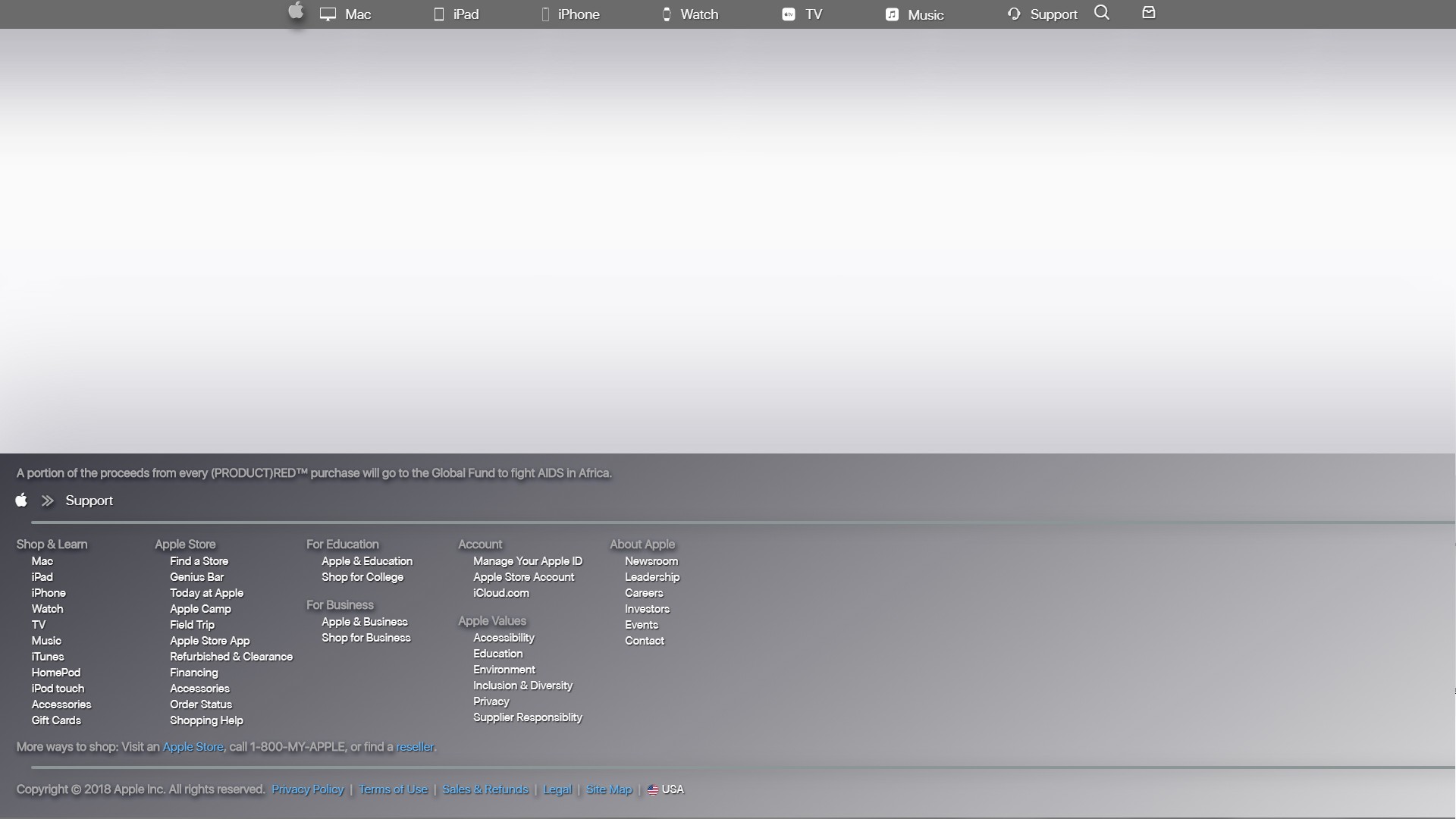
Support:
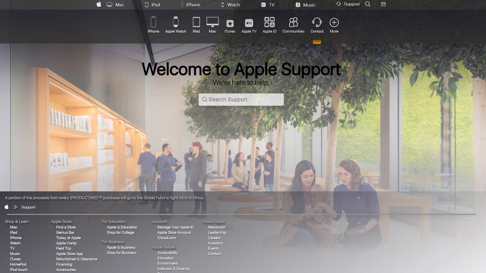
The original Apple Store background image here is overlayed with a white gradient. It is a bit too crisp and jarring so the logo needed to be knocked back with some background 'haze'. Headphones are chosen for the support icon. It works well, but Apple might prefer an officially approved product for the icon. A lot of the UI is cleaned up, mainly by placing icons into the sub nav and adding a '(+) More' for loading more elements.
The search field does not process input, but it looks posh. It is ready to be hooked up via google or an elastic search library. Transparency is added and the hard separation between the magnify glass and the field is removed. Centering and scaling is slightly different than the original, but we get a much better view of the Apple Store, even with scaling at 1080p.
The footer is brought up higher, which allows for pages like support to function as a mini-sitemap. And check out the footer transparency in action. It does not quite fit in a 1080p frame, but the results at this point in development fit nicely.
Mobile:
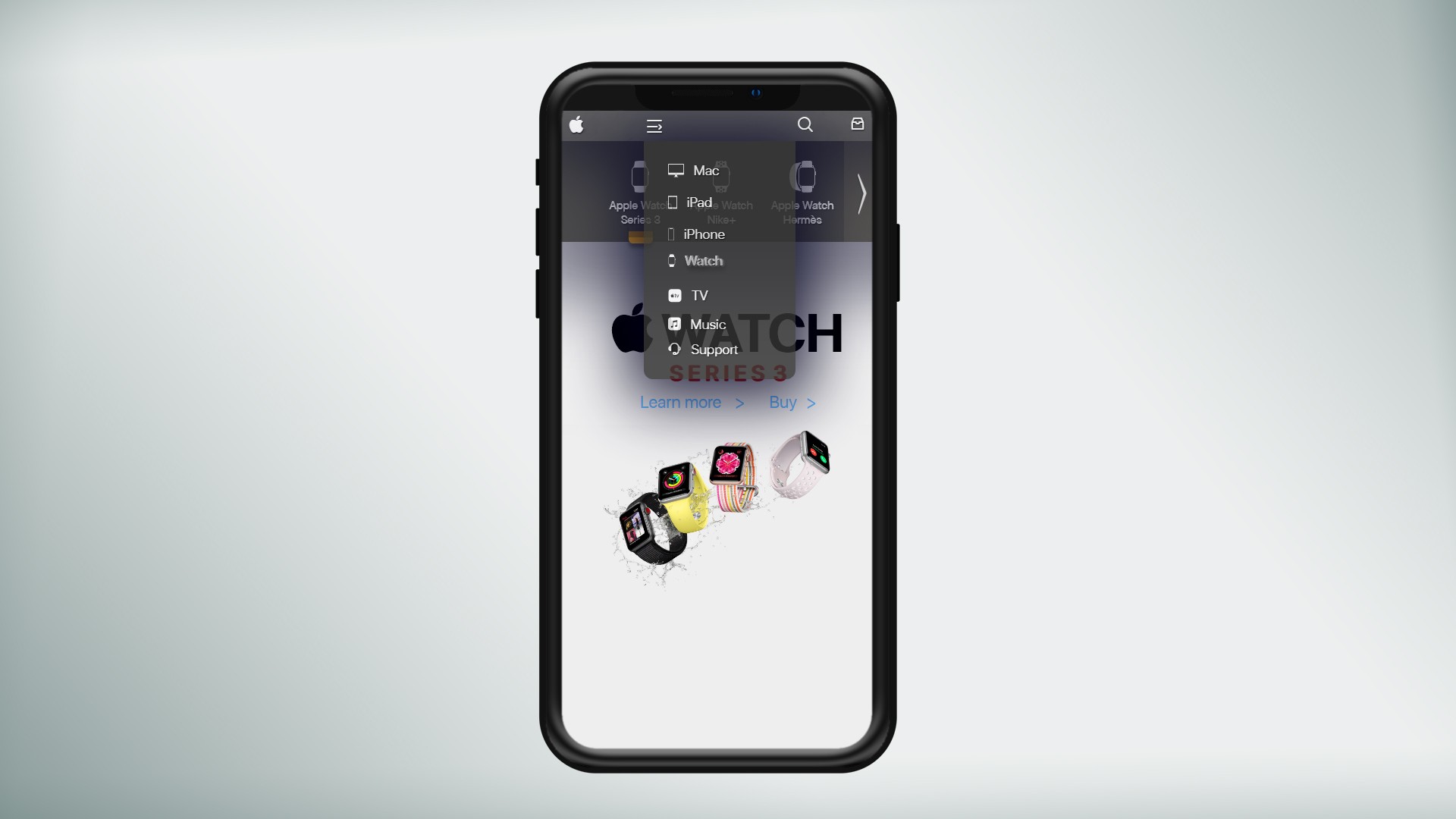
This is the current MVP state of the 'Mobile' desktop site. It is just a media query at width on the main nav to restyle it.
The current black background Apple has with on mobile nav is high contrast and boring. Transparent grays and browns are much more classy and luxury brand centric (outside of film). The original animation is also a bit awkward and slow too. It lags to get the menu and type in place and ready for use. Nothing really says 'Apple' about it and seems tacked-on.
The current version of the mobile interface is usable, but it really needs some better sizing and spacing for 'fat fingers' (or the minimum size for mobile UI). The main nav background could be tweaked to be less transparent (or more opaque). It would be best to retain some standardized transparency, even if usability or style requires the mobile menu to fill the screen (like the original black one).
Like this post? Read more from the ^UX topic.

React with Router & Redux