Oct.05.2019 redesign of Firefox.com into a unifying cloud platform.
PART 1: usability issues.
PART 2: UI updates.
This redesign (or reUX) samples the original Firefox web site, but goes deeper, drawing inspiration from dark interfaces found in professional tools like Visual Studio Code and Adobe Suite. It then modernizes the systems and transitions from traditional apps and landing pages to a Platform as a Service (PaaS).
Newly designed icons for enterprise, cloud apps, and various devices are also included.
PART 1, Usability:
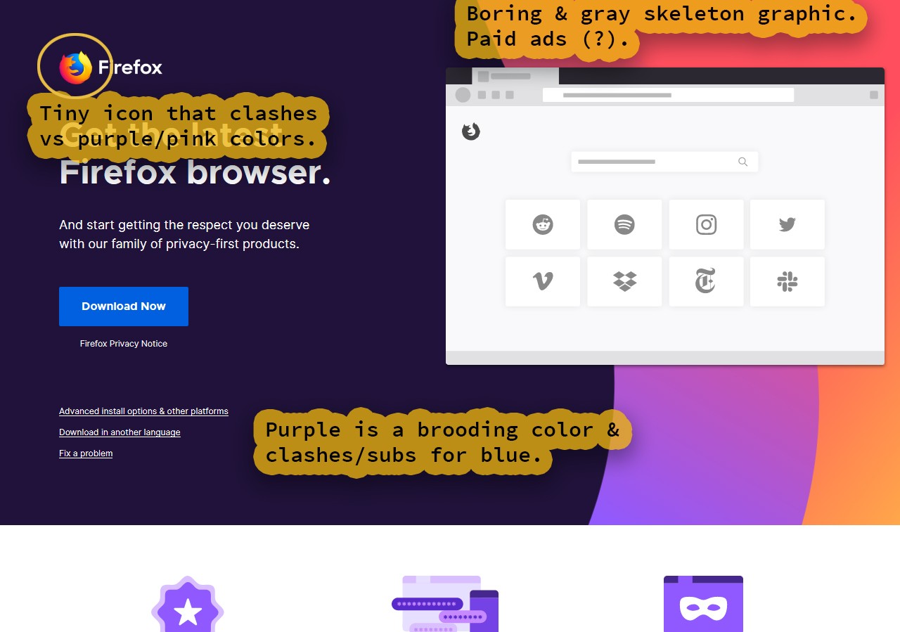
This purple and pink is somewhat retro. I know retro 80's style is in right now, but is that really what Mozilla wants to dominate the Firefox brand? Also, splash pages are for user acquisition and conversion (like email submissions and sign-ups), yet there is nothing to do here beyond downloading Firefox.
Cloud Page Issues:
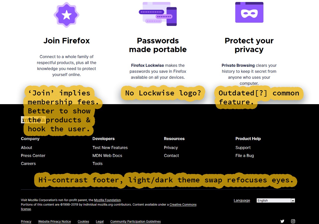
Lockwise is not linked and neither are the other icon sections. In SaaS (Software as a Service ) the best practices have been to avoid any premature sales triggering language like 'Join'. Regardless, the join content is unlinked so you can not sign-up (which defeats any marketing pitch).
Quantum, Rust coding (like memory models), and fresh addons are the current product features. Private Browsing is from many years ago. Tor support (The onion router) surpasses and replaces this feature.
Menu Issues:
Firefox does not have Tor, but Brave and the Tor Browser (a Firefox fork) do. Plus, Tor itself has privacy and security concerns since governments and intelligence agencies run servers for them. There are also known vulnerabilities that entities with teams of data engineers and cyber security personnel can access.
Is privacy still the selling point of Firefox? Perhaps the browser is more fun to use and cutting edge? 'Fun' and 'cutting edge' might be a pivot to consider (unless Firefox is expanding competitive security services like the more private browsers above).
Component Issues:
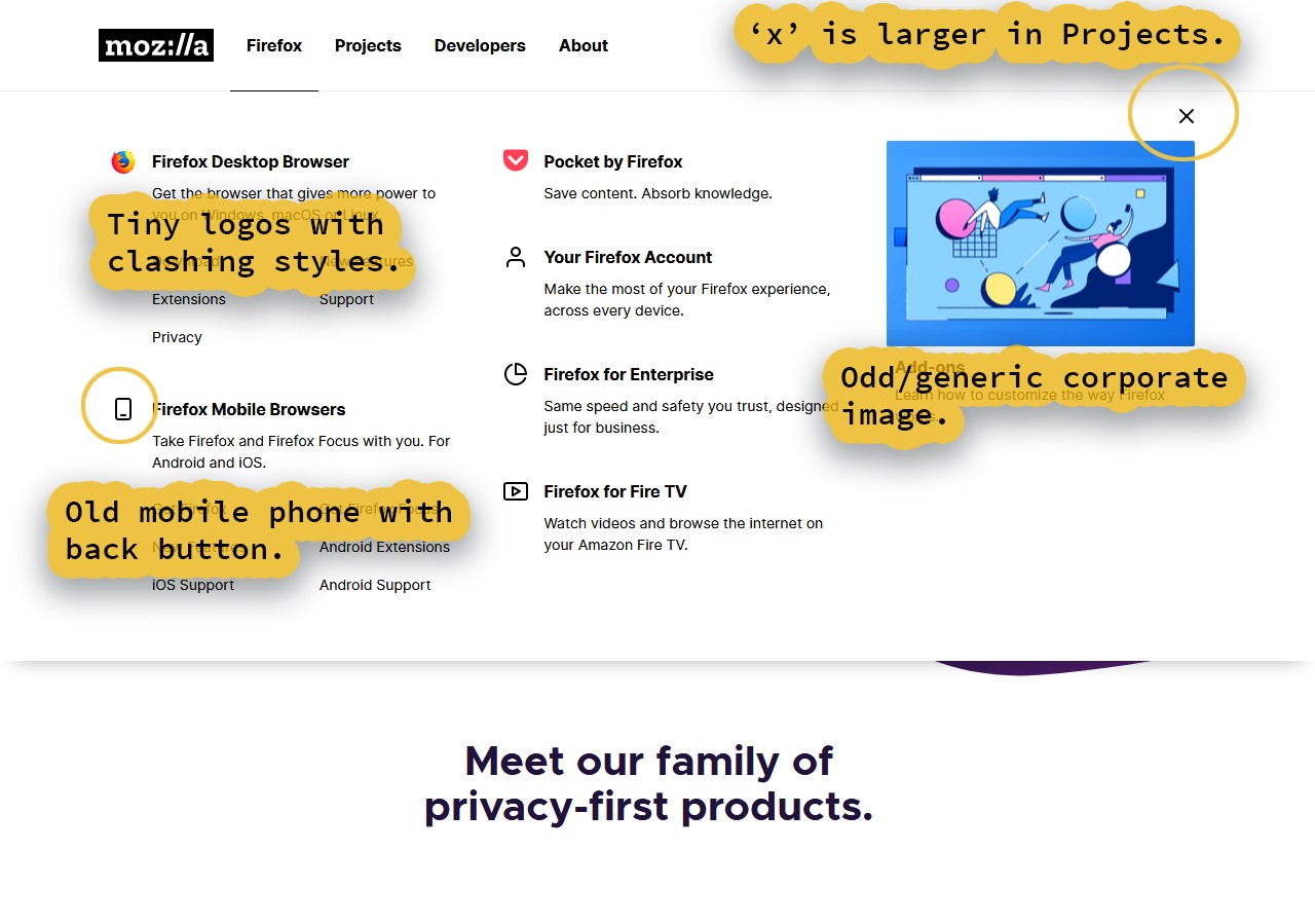
Newer UIs (user interfaces) are becoming larger and more streamlined, not only to work with phones and tablets, but also much more common touchscreen laptops and TVs. Size and simplicity are key, especially since fingers and styluses (touch-screen pens) have a physical width. Many of these sections can be replaced with a headroom or a 'main-nav to sub-nav' architectural pattern. Tabs are also another option.
Brand Issues:
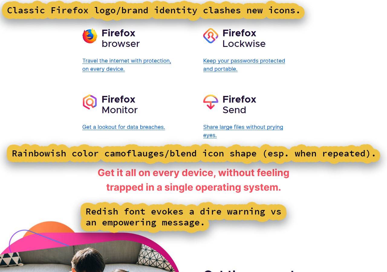
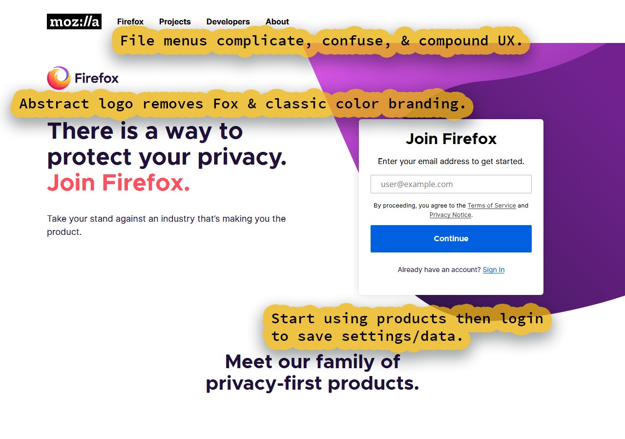
The greatest asset Mozilla has is the Firefox brand and identity. That includes both the vibrant blue and oranges with the shapes of fire and a fox. These new icons are outlined in such a way to have non-distinct silhouettes (like diamondish with a circle and some lines). These could be icons for roughly any brand and suit a multitude of purposes.
You are giving up your branded colors (along with the fire and the fox) for no discernable benefit. It might be considered fine now with only a few icons, but what about when there are 10+? A slew of melty candy canes comes to mind.
Yes Google is currently adopting a similar style, but they have used a double edged sword of weak designs with speedy simplicity (like their rainbow Times New Roman font for their logo, but less widgets and clutter). We can emulate the speed and simplicity without embracing other design drawbacks.
Content Issues:
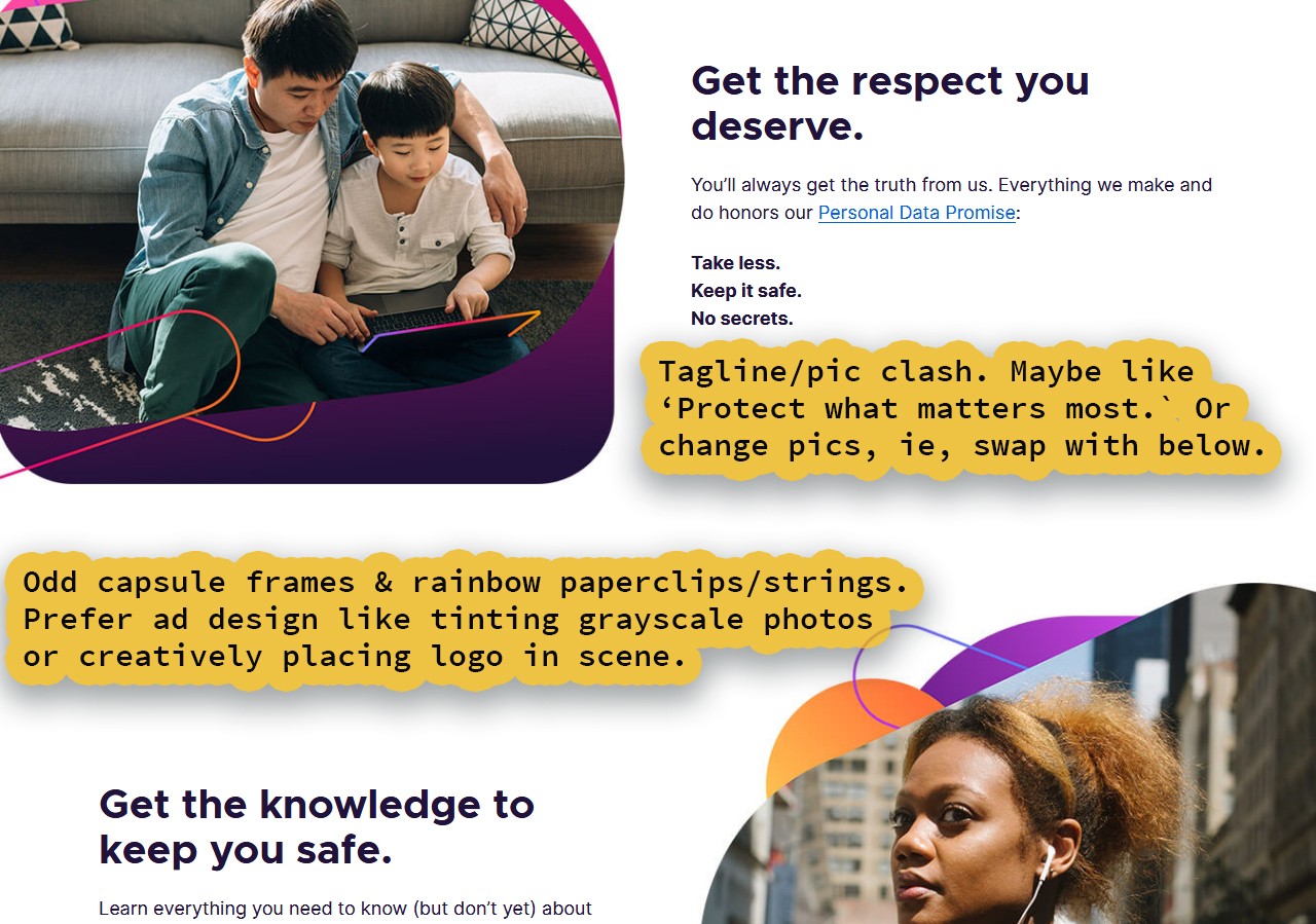
Is this copy just filler or is there a reason we have it down here? The year is 2019 and most marketers place video (like testimonials) at the top of their page. Are customers reporting 'getting respect' or 'the dangers of web surfing' as the prime factors for Firefox use? Firefox used to be #1 because of developer support and following web standards.
Like most apps, the user priority should be:
- 1. Speed and responsiveness.
- 2. Layout compatibility and lack of bugs.
- 3. Plugin ecosystem, marketplace, and ease of use.
PART 2, Redesign:
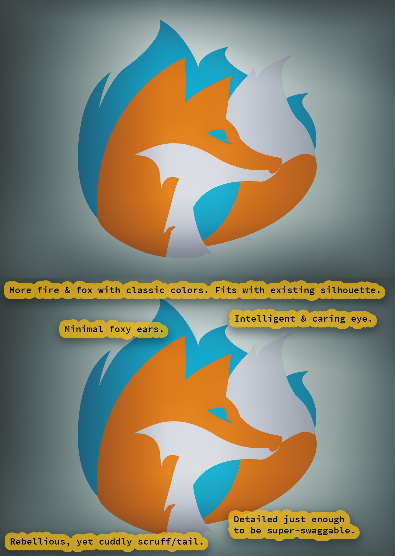
More fire, more fox.
Here is a logo that retains the design and color of Firefox at its peak. Yet it simplifies and improves, a modern flat style with clarity paramount. Swag and likeability are important factors in retention and branding.
NOTE: smaller resized icons need darker outlines and sub-pixel detail to really tighten-up and pop (gradients are not necessary).
UX Redesign:
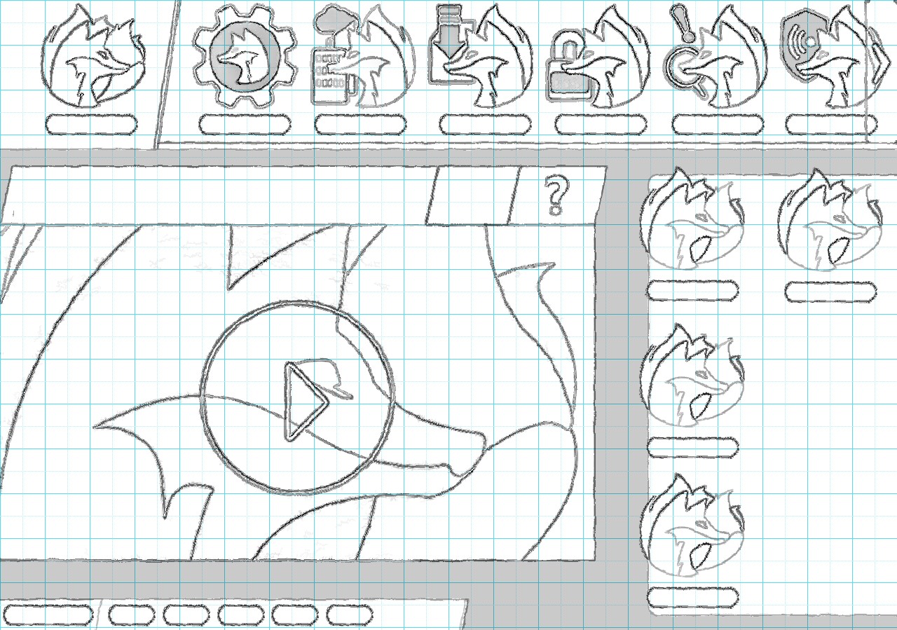
Logo-based sketch.
Now that the logo is done we can use it to sketch-in and formulate icons and components. It is rough, but this is just to begin the initial layout and blocked forms. Digital shading can be applied to both pop and highlight sections.
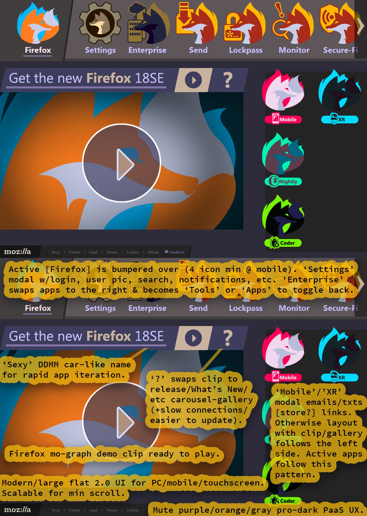
From cluttered to clean.
Notice the subdued purple and oranges really knocking back the interface and unleashing the icons to pop with vibrance. A modern Flat 2.0 (or Flat+) interface is a flat style with depth indicators to separate out components and content (using a minimum of such cues). Here, both the main carousel, its active item, and the footer have depth cues.
A flaming fox has instant appeal and is included in every icon, which solidifies branding while also establishing a professional yet personable experience. Plus, it is like the hyper-successful collectables from Pokémon or Hello Kitty. NOTE: some of these apps have been renamed to be more clear and unique.
Various models of the Firefox browser appear as codified palettes, following a new unified style guide instead of the previous mishmash of recolors and random alterations.
▼ Firefox sub-icons:
- ☑ Mobile: a modern phone with no back button.
- ☑ XR: an XR device with a slim form factor on a gender-neutral head.
- ☑ Nightly: a moon with a puzzle piece missing.
- ☑ Coder: a bug with a removal 'x' on it.
▼ App name changes:
- ☑ Lockwise to Lockpass: the word sounds more like 'password' (also a pass for locks).
- ☑ Protected Network to Secure-Fi: highlights the security feature, making it a much more relevant name.
- ☑ Developer to Coder: a compact name similar to the popular IDE Visual Studio Code.
- ☑ Reality to XR: covers evolving experiences without mislabelings or community uproars (see below).
▼ AR, VR, MR, & XR:
This industry is rapidly expanding and growing. VR (Virtual Reality) and AR (Augmented Reality) are overlapping more and more. Still, many professionals and users still vocally demand distinction between various experiences and an aversion to buzz words or trendiness.
MR or Mixed Reality must include interacting with reality outside of an augmented overlay and audio. Like changing stage lights, turning on or off fans, scent stimulation, and robotics or mechatronic locomotion (such as a conveyor belt).
NOTE: XR or eXtended Reality (or even just X Reality) is the direct and proper way to refer to the umbrella of all these experiences.
Like this post? Read more from the ^UX topic.
Prime Video reUX
