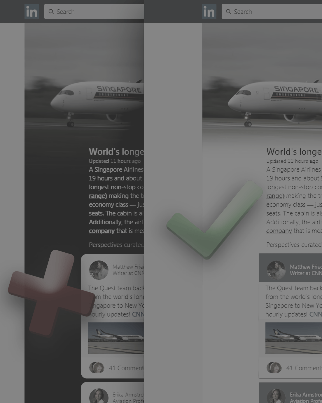
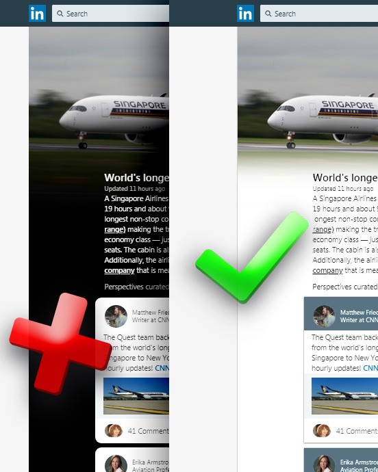
As of Oct.14.2018 LinkedIn’s news feed looks like this:
Feels like we are going back to early Web 2.0 here.
The problem?
- ☑ It does not match the established styling and color scheme.
- ☑ High contrast and black on modern screens causes eye fatigue (even pain).
- ☑ Pictures become more ominous and dingy with the black gradient.
- ☑ White cards resemble adjustable modals.
Yes, CNN and other outlets (particularly publications) use black backgrounds (anc continue to for decades). However, in print there is ambient light and grain. Older screens have washed-out blacks and scanline or dot matrix diffusion. You do not get the gleaming whites on darkness that we have today. That’s part of the reason why modern sites use black alternatives like dark chocolate, smoky gray, or faded purples and blues.
If you still want to use white on solid black you need to at least temper these whites much more (which may make things look dull).
Retro gamers love Cathode Ray Tube (CRT) grit ❤.
To remedy these dark concerns, this UI mock-up was born:
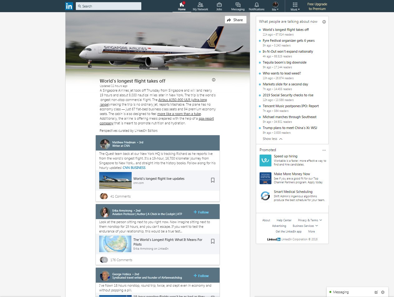
LinkedIn looking like LinkedIn again.
This specifically addresses:
- ☑ Seamless blending with LinkedIn using the same screen space.
- ☑ Soothing low contrast with accents where needed.
- ☑ Pictures are now more fresh and airy with the white gradient.
- ☑ White cards have colorized labels to pop and look as expected.
But where is that gray-blue from those labels from? It is snagged from our profile dashboard:
LinkedIn's forest green nav bar at the top would also benefits from this shade of this too.
Now you may notice it is a tad darker from the averaged color. That is so the ‘+ Follow’ links are more visible. To do this the luminosity was dropped while upping the saturation (a trick to retain more of the perceptual feel to the color). There is room to go darker, but this should be a good starting point.
All this makes for a much more pleasant experience, no?
Wow look at those visual aid icons. This for the TL;DR people.
LinkedIn is an often necessary social media site which means its users are especially subject (read vulnerable) to eye strain and headaches from lengthy usage. A little care and consideration go a long way here.
Happy eyes = Happy brain
Now if only LinkedIn can give their users an option to remove that recent ‘see more’ profile shortening. You know, for those who know about design and want their content unhidden and gimmick-free.
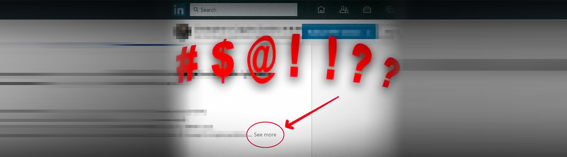
Some day LinkedIn. Some day. We users shall rise-up and fix it all.
Like this post? Read more from the ^UX topic.
Apple.com React Redesign