Dec.30.2018 redesign of the Mattermost chat client.
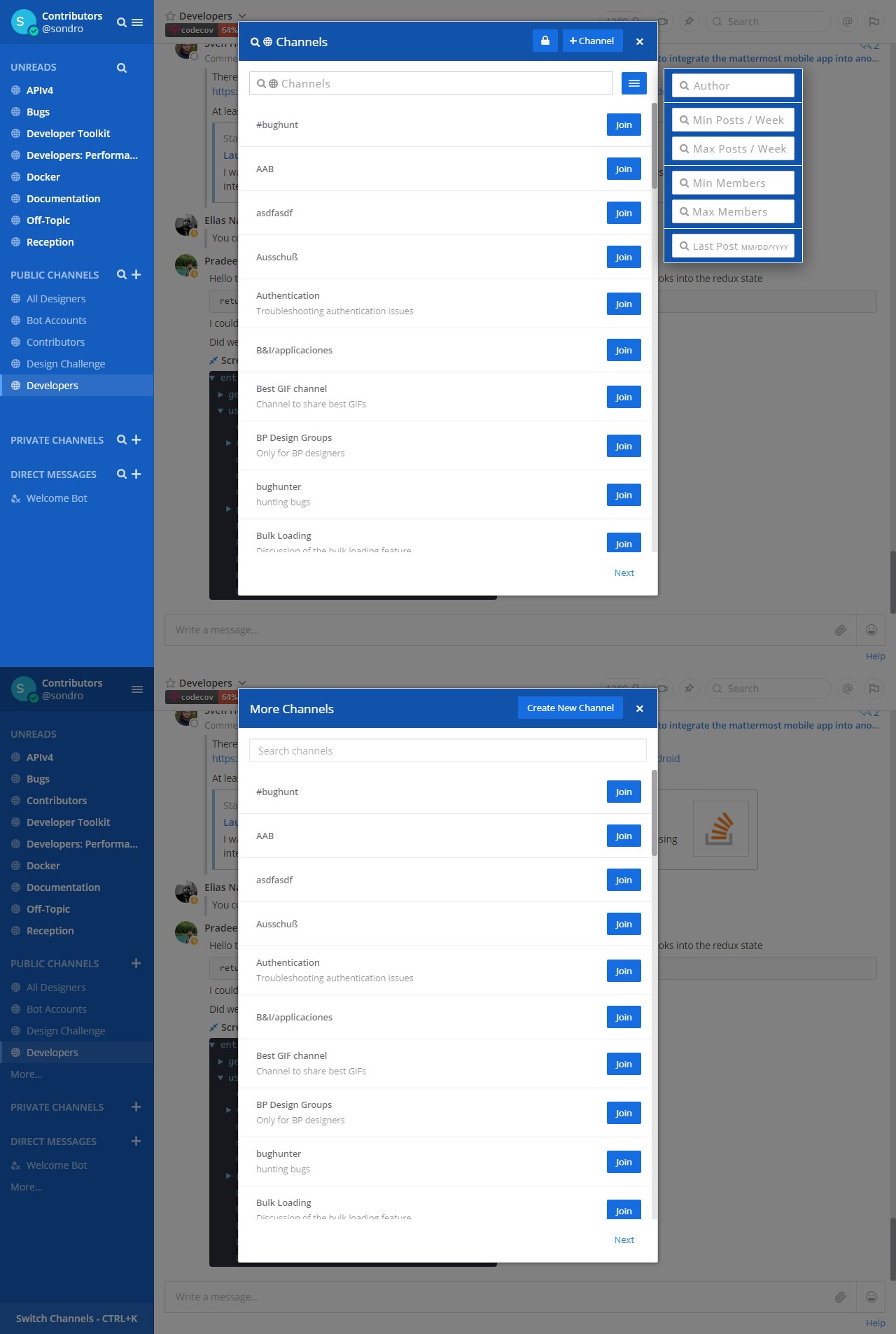
Search Channel:

Currently when searching through channels you get a mass of rooms and are required to be invited to invisible private channels. This is remedied via a streamlined UI and search / filtering interface.
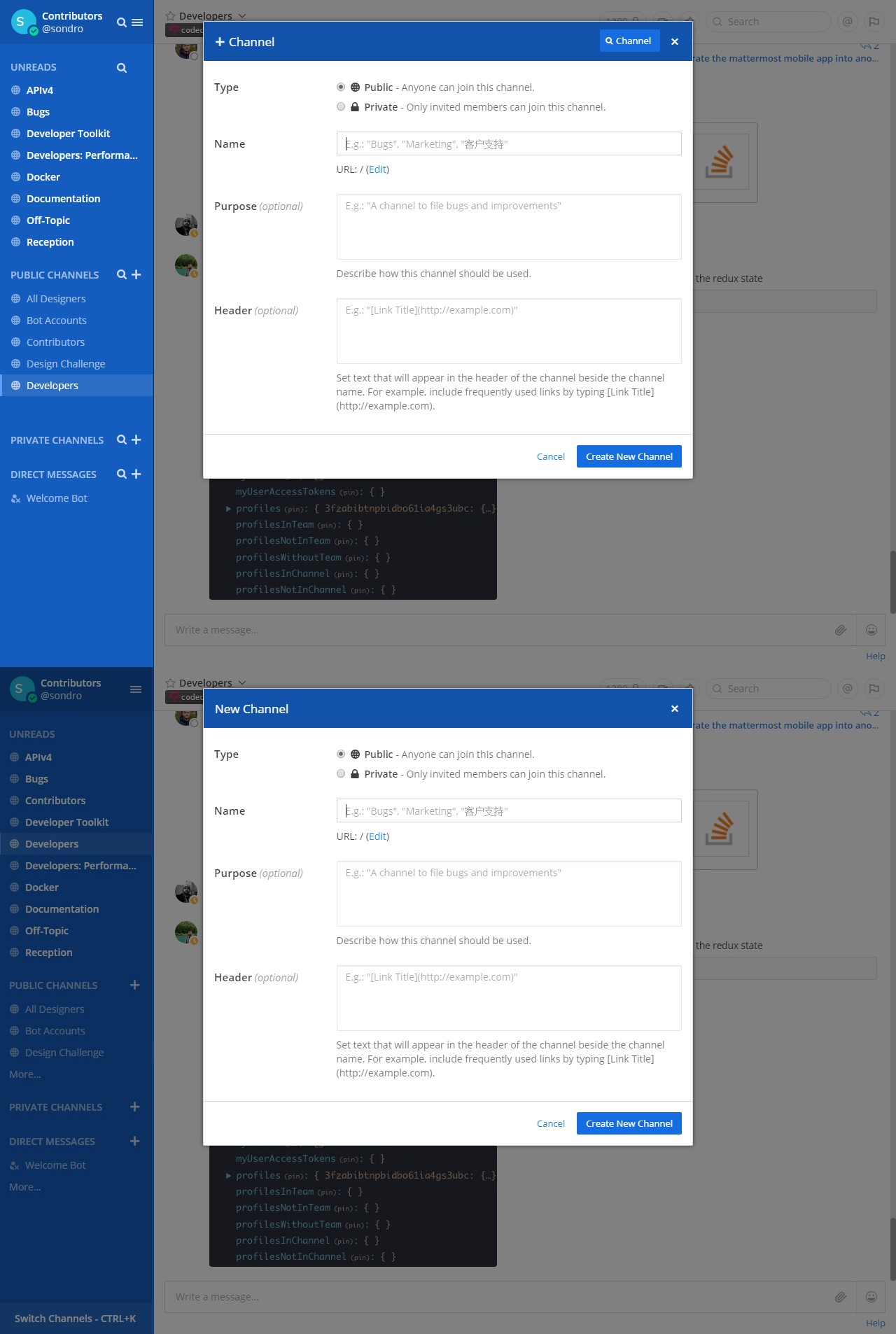
New Channel:

The search filtering integrated with channel creation. This helped both train the user to use both functions, but also easily switch between them in the case of uncertainty or a mistake. The UX should be patterned as much as possible so the user does not have to learn new techniques with each function or struggle against the interface.
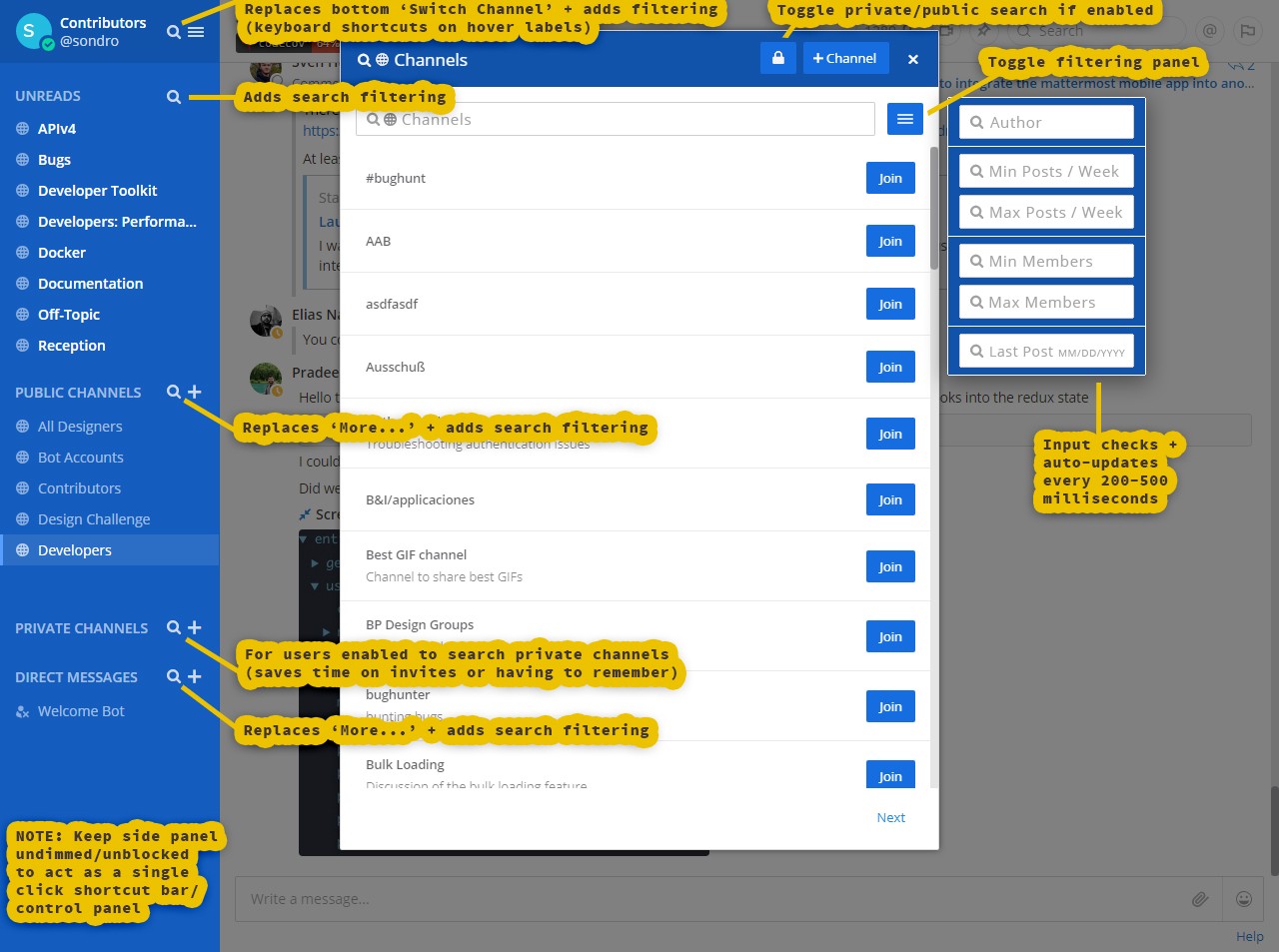
Overview:

The full breakdown. One of the keys here is not blocking the side panel so you can use it as a shortcut panel. This is particularly helpful in the case you select the wrong section or function.
Like this post? Read more from the ^UX topic.

React with Router & Redux
