Jul.25.2019 redesign of Amazon Prime Video.
PART 1: usability issues.
PART 2: UI updates.
This redesign (or reUX) is based on the existing web site. It is not specific to any platform other than horizontal-ratioed screens. Pointer hovers are omitted and larger components are preferred when possible to give a good starting point for TV (Fire), mobile, Kindle, iPad, and other devices.
PART 1, Usability:
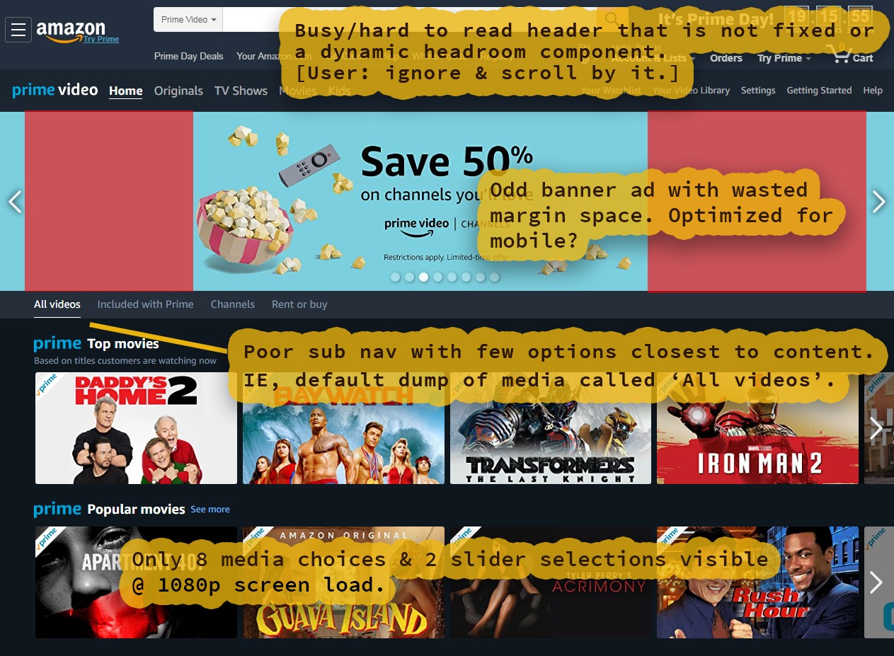
First, there is a need to eliminate excessive scrolling. Why? Because scrolling (especially vertical) triggers psychological disinterest. This is a well-trained trigger from both social media feeds like Instagram, as well as older TV interfaces. Once the user has entered this state they are likely to exit the app with a feeling of dissatisfaction.
We want to load as much content and data within the same area as possible. Plus, work towards regularly rewarding the user (gamification loop). So scrolling is a limited buffer, and before we hit that limit we want to instead gift the user with positive interaction and feedback. Analytics show us what to prioritize, but we also have user research.
From my research on YouTube and various blogs, the biggest complaint on Prime Video and Fire TV is an inability to narrow or find quality media. Netflix and other streaming services have similar issues so we can not simply duplicate their interface without also duplicating this problem. We shall explore narrowing the UX and also creating a democratic recommendation engine in Part 2. Before that we need to pile-up more issues so we can address as many as possible.
Content Issues:
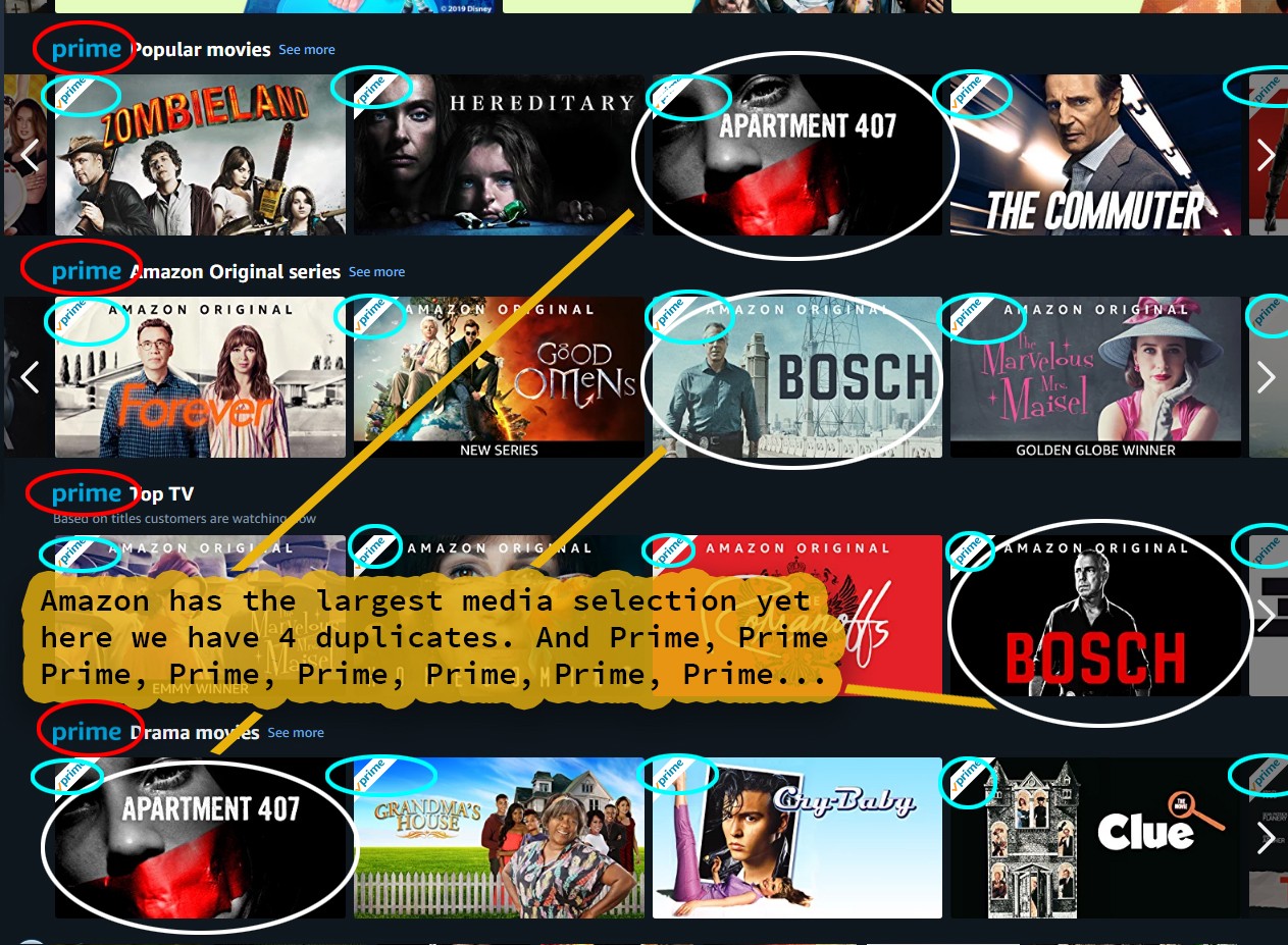
Often in engineering there is talk of simplicity, Zen, or KISS (Keep It Simple Stupid). Hard data shows that dating app users often become bored, frustrated, and disenchanted with the experience due to an abundance of similar choices. The current Prime Video UX is similar to a 2000's dating site in this regard. Boxes and boxes of labels and choices, but many are very similar and repetitive.
Ironically, despite this cognitive overload there is plenty of cloned content. We also obtain a second strike for vertical scrolling with an endless buffet of sliders. These sliders then require horizontal scrolling as the user plods around. I am a fan of sliders, but there is a better way to combine them with other components for precision and ease of use.
Details Issues:
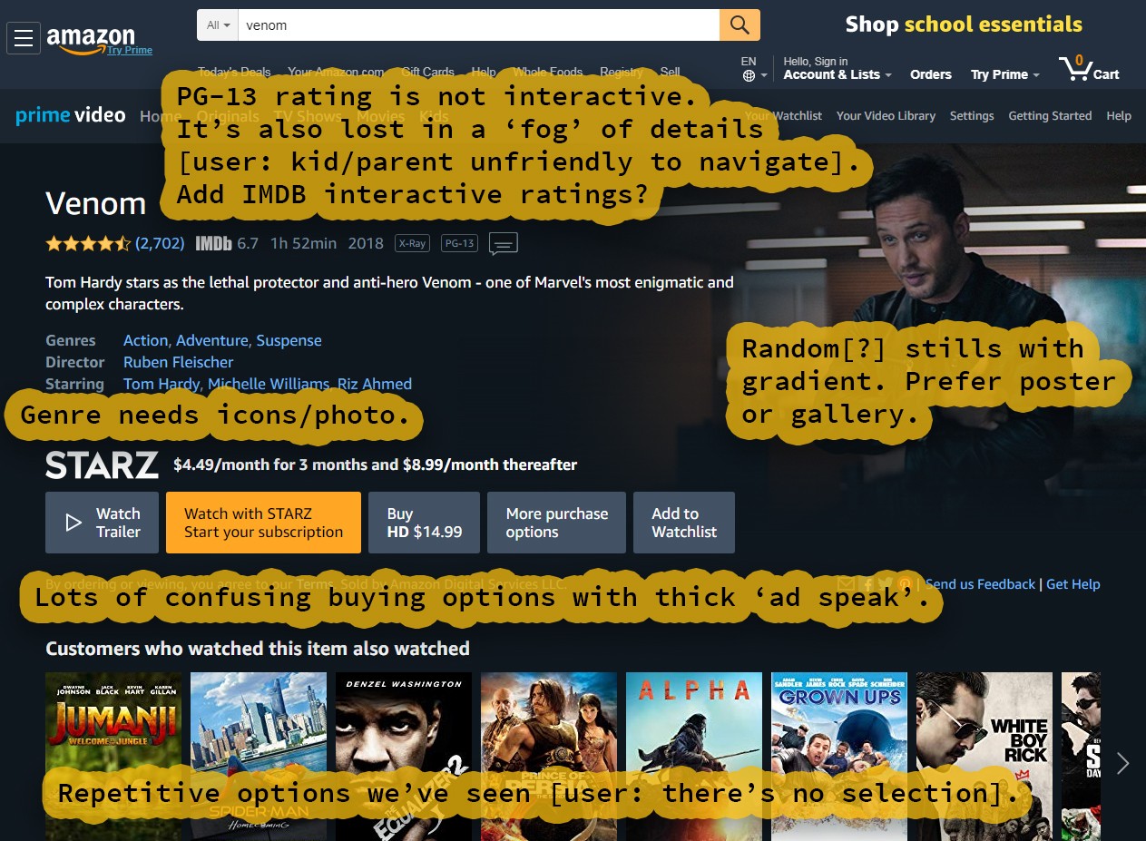
Finally we find a worthy film, but the info is cluttered and the buttons are inconsistent. Also, what is with the sales talk? It even carries over to the tiny text on the buttons. And remember, these buttons are changing per media selection so the offers and fine print constantly change with them.
Lower Details Issues:
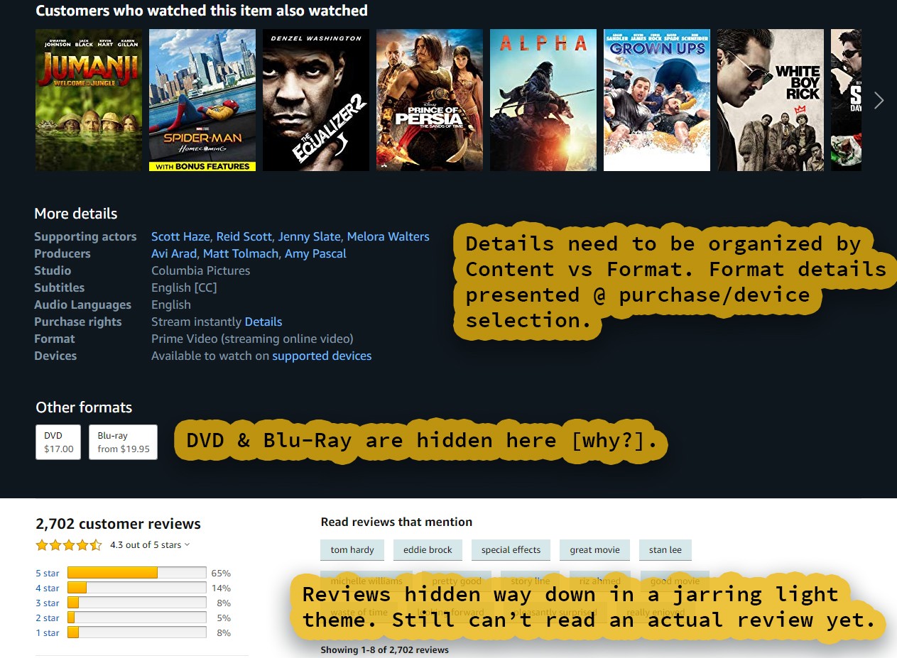
DVDs and Blu-ray discs are physical media in the process of being phased-out. Still, the buying experience should put the customer first. How about placing them at the bottom of a modal with all the purchase options? This not only reduces scroll, but also cleans up the presentation and clutter.
After some more vertical scrolling, we arrive at the reviews. Yes, the rating links are present above, but none of the navigation or content is fixed in place or patterned. This means the user will scroll by these links. Also the light theme here is pretty bland, it is like this site can not decide what style it wants to present. Eyes can adjust to either light or dark themes, but abrupt changes cause needless strain. Consistency is key.
Missing Details:
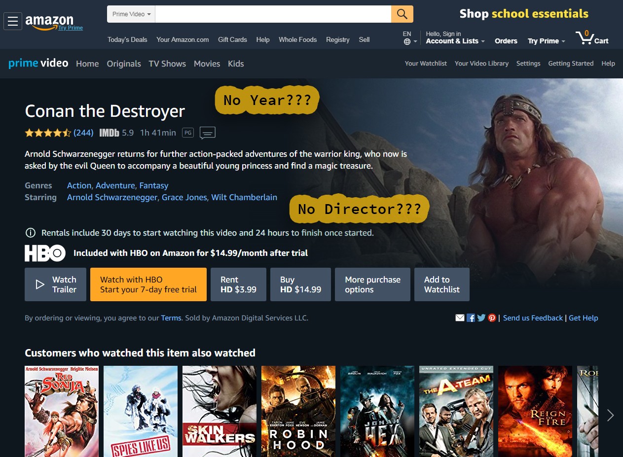
Skimming through the branches of popular films we find several with missing details.
Once Upon a Deadpool ↗ is missing the year.
Conan the Destroyer ↗ is missing the year and the director. Why not cross-reference or import existing data with IMDB to avoid manual entry? There is scraping, a public API, but Amazon owns IMDB so perhaps a more direct method of data sharing is possible. It is an idea worth mentioning, especially since it may increase not only accuracy, but sales.
PART 2, Redesign:
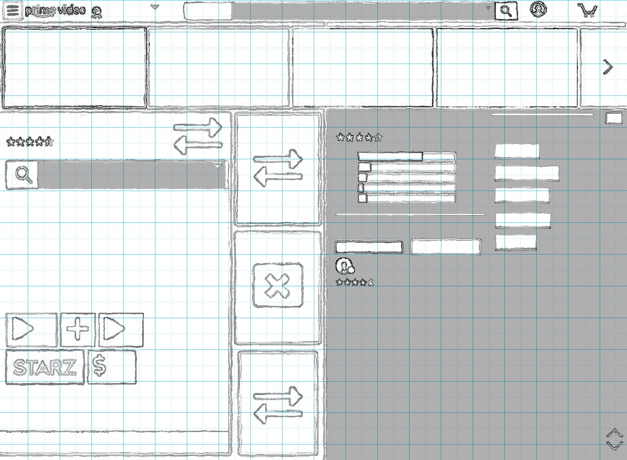
Panel-based Sketch.
Using our notes, we rough-out a clean and clear layout. The idea is to reduce complexity while enhancing usability. Larger buttons and more of a touch screen orientation is a plus. Yet still we respect the power users who desire detail and depth.
Less Scroll, More Play.
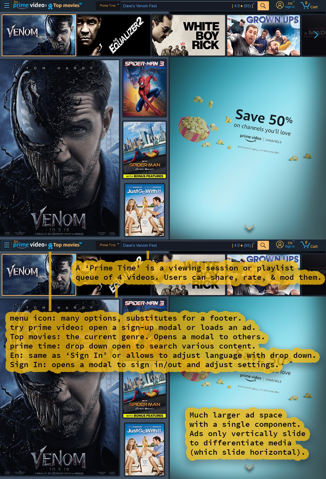
Introducing Prime Times: the customer powered media experience. Create, complete, and rate them to earn badges. Capitalizing on Amazon's lead in media diversity and selection, users develop a social stake in both the content and the platform itself. With Prime Times there is always something ready and something new.
Forward with an eye on the future, stream what you love, then purchase extras like games and merchandise. Amazon is now alive with challenges and exploration, a democratized product transforming Prime Video into social media.
Anatomy: Prime Times have 4 media slots of 5-12 hours of content. More than enough for a date night, sick day, and most movie marathons. Plus, it placates the picky viewer who prefers to fine-tune or skip through media choices.
The new ad section is so spacious you can have animated content such as games, apps (chat), and video. You can also store the archived or suggested Prime Times in this slot. No space is wasted as you will see below.
This design sports a strong unidirectional data flow with top-to-bottom and left-to-right navigation. Yet even with grand film posters there are still 7-10 media choices with 2-3 drop-downs for narrowing. This is about the same as previously, but much more clean and organized with a primary focus and buttressing elements.
Prime Times:
Notice the colors: all clickable text is some combination of blue and yellow. This pattern not only creates more clarity and style, but allows for important data (like titles) to pop on smaller fonts and components.
These drop-downs are for selecting Prime Times. They have their own separate clickable ratings and reviews. Maybe the format of 5 Stars can differ for Prime Times (like 0-100% for unique clarity). Always putting the customer first, why not have their circular user portrait adorning the Prime Time (a badge of honor and recognition for their hard work).
This also allows celebrities, influencers, or even companies to create and share their own Prime Times and possibly connect it with the large ad space below. Want to watch Star Wars in the order George Lucas intended? Not only is this option available, but you can also rant in the reviews about how HanShotFirster's Prime Time is superior. And this finally links the gamification loop with the release of dopamine.
Mod & Exchange:
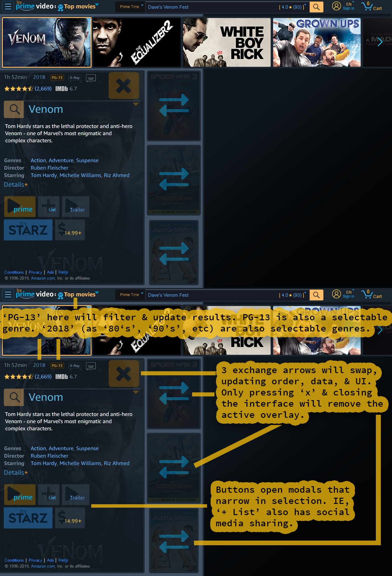
Not only can you easily view your selected media without leaving the page, but you can also rapidly exchange and modify your Prime Times. Advanced features include filtering and genre selection by both year and rating. Simplified buttons are strikingly clear and organized. The combination of button transparency and space allows for the poster background to still be readable.
Search & Swap:
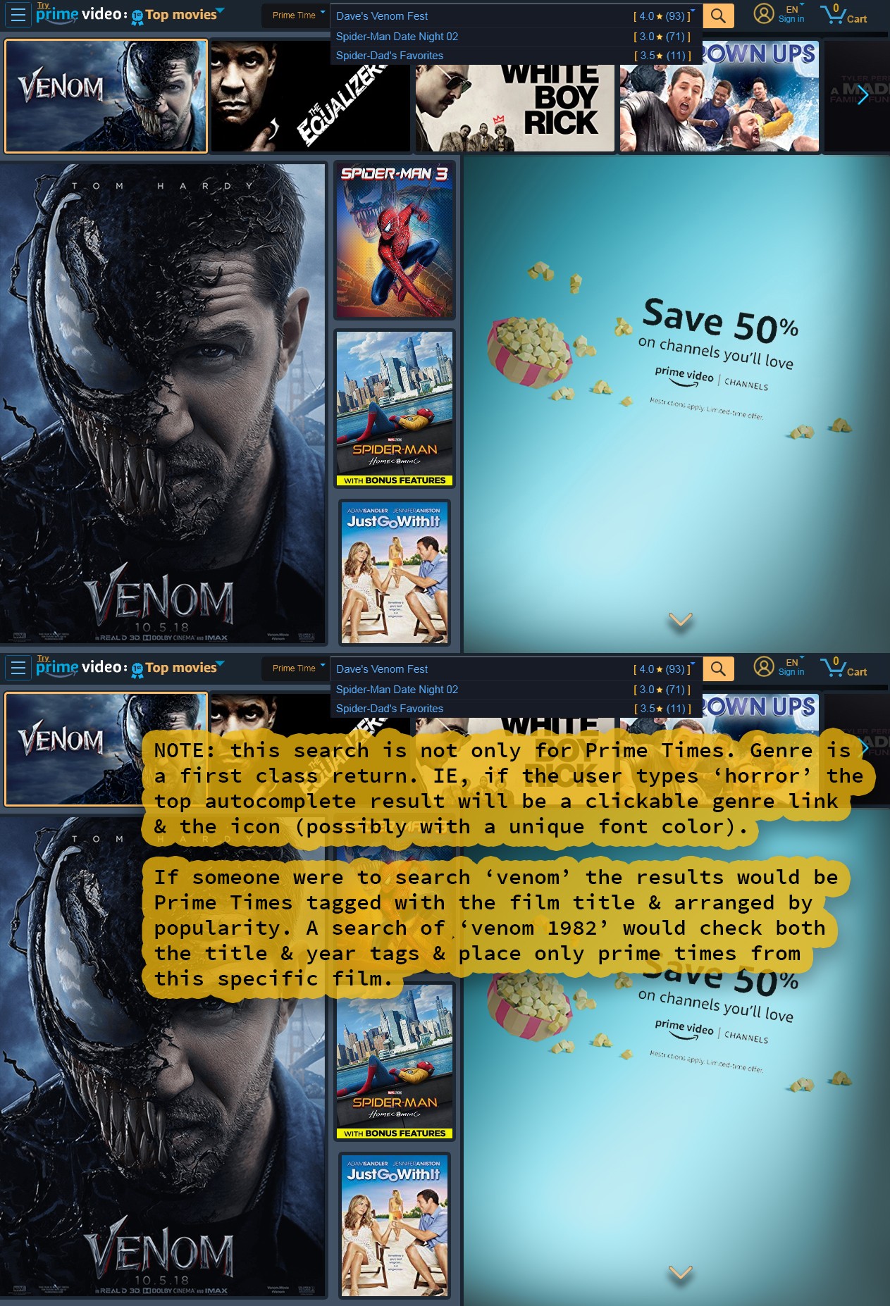
Media drop-down menus kill another showstopper: the confusion between bonus content and standard. The sliders often waste space placing both versions neighboring one another. Now you can simply list the most popular and then have nested alternates.
This feature doubles for media with the same title (listed by popularity). But what if you're still dissatisfied and can not find what you want? Just type in your search and the auto-complete (or Alexa) populates new selectable media.
Mini-Sliders:
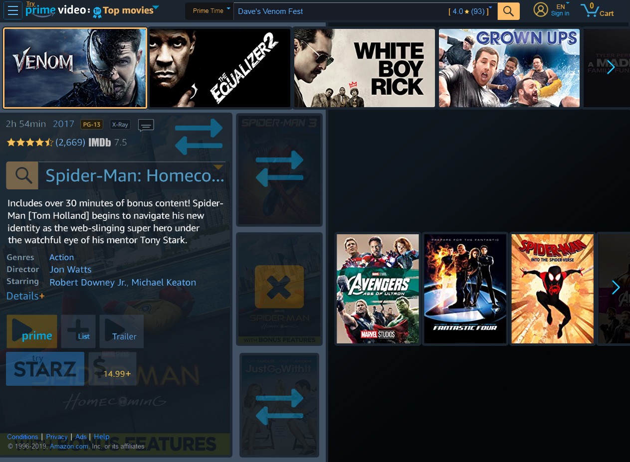
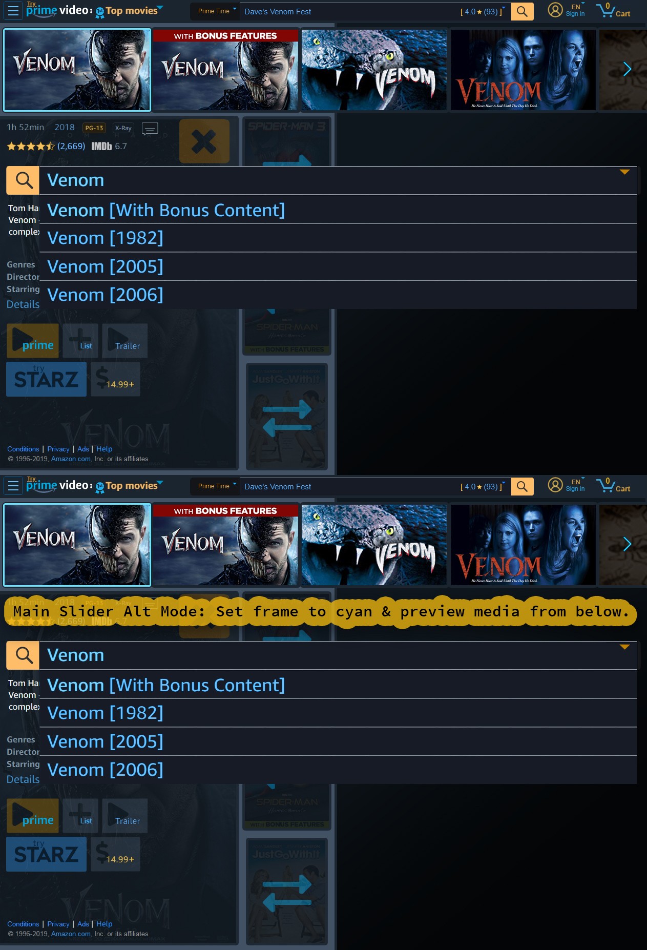
We hit the 'x' to close the interface overlay and then select 'Spider-Man: Homecoming (Plus Bonus Content)' on Slot 2. It expands a focused mini-slider for additional choices with little cognitive strain. We also take-over the main poster of Slot 0 for data display, but can still see from above that the media slot is 'Venom'.
And notice how the search menu truncates long titles. These have plagued films for decades with no easy answers. Search components are complex, but thanks to the popularity of Google, most users have a pretty solid understanding. For power users there are boolean capabilities, but everyone can benefit from autocomplete and Alexa to fine-tune here.
An example of the default slot format for Prime Times is:
- ☑ Slot 0: the main media selected above.
- ☑ Slot 1: an older film of related content (or 10+ years newer if the main title is old).
- ☑ Slot 2: another popular film related to the main title, sandwiching the old with the new.
- ☑ Slot 3: something a bit different to take off the edge or explore (like a comedy if Slot 1 is action and adventure).
Expando Drop-downs:
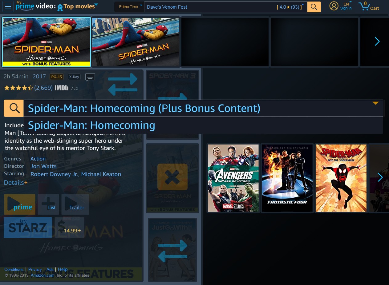
Yes, searches expand for Venom with long titles, but this Spiderman Homecoming is a particularly long title. Adjustable font size can help, but the great thing about search components is that the shortening and scrolling of long text is a mature feature.
NOTE: for some reason the labeling is '(Plus Bonus Content)' while Venom is '[With Bonus Content]'. It helps to establish a style standard or pattern. Parenthesis '()' are preferred because it is distinct from the year in brackets '[]' (like when multiple choices have the same title as 'Venom'). Another option is some additional shortening like '(+Bonus)', or even a single character or icon (like '+B' or a gift box SVG).
Reviews:
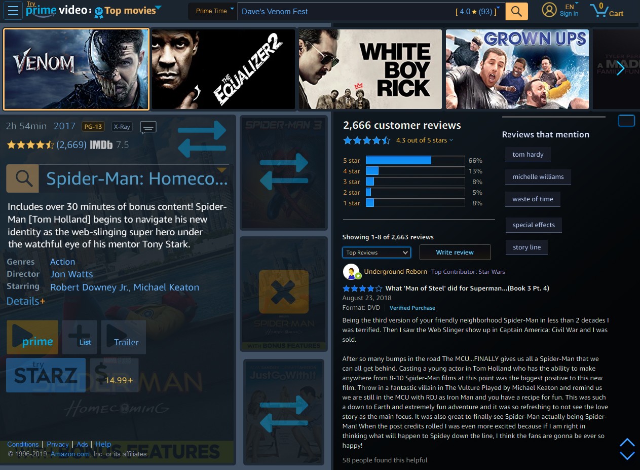
Select a star rating and receive Amazon media reviews seamlessly integrated into the ad space (and with a new dark theme). The stars are changed to blue so they do not distract or confuse with yellow stars elsewhere. Fans of the 'Pro versus Con' review format will now find that option under the 'Top Reviews' drop-down.
A custom vertical scrollbar is available for framed or customized panel content. The ability to load Prime Time reviews by selecting from the search drop-down above will also work. Another possible review inclusion is IMDB, which will bring in more media-centric fans (perhaps Amazon can even open up the excitement of cross-posting to both sites).
Like this post? Read more from the ^UX topic.

bcrypt & JWTs vs Cookies