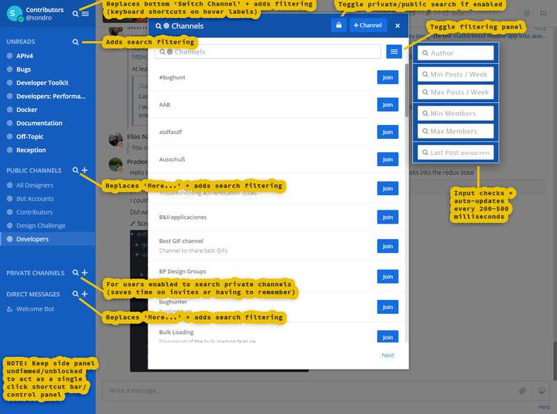
Aug.28.2019 redesign of GitHub's Enterprise landing page and branching content. It also features brand management and marketing strategies to convert existing GitHub users to Enterprise. This requires maximizing content, pageflow (user navigation analytics), and CPM or costs per thousand impressions. NOTE: impressions are measured ad views ('M' is the Roman numeral for thousand in CPM).
PART 1: usability and presentation issues.
PART 2: User Interface updates, focus, and strategy.
This redesign of the User Experience (or reUX) does not include Enterprise content itself since it is hidden behind a paywall, requiring a credit card to access. It is also beyond the scope here and can be later patterned after design approval and established strategies.
The purpose of this section is to identify gaps and bottlenecks during a user persona trial.
PART 1, Usability:
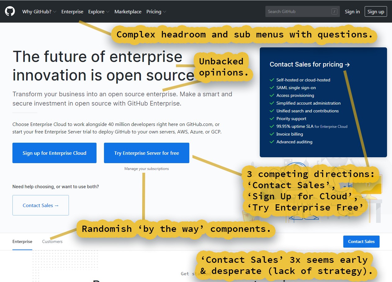
This is the start of the Landing Page and what roughly falls onto the screen and into the frame. The key takeaway here is a distinct lack of strategy communicated to the customer via fluff padding and a hand-off to sales before the deal closes.
NOTE: even if contacting sales is absolutely required, studies have shown customers, and especially web users, are shying more and more away from this approach since it has a history of pushiness, uncertainty, and wasting resources like time.
The sales contact should be dropped with this sensitivity in mind, framing it as a material luxury craft. Like 'we love customizing architecture, let us customize yours'. Or just simply, 'let us customize your architecture'.
Details Issues:
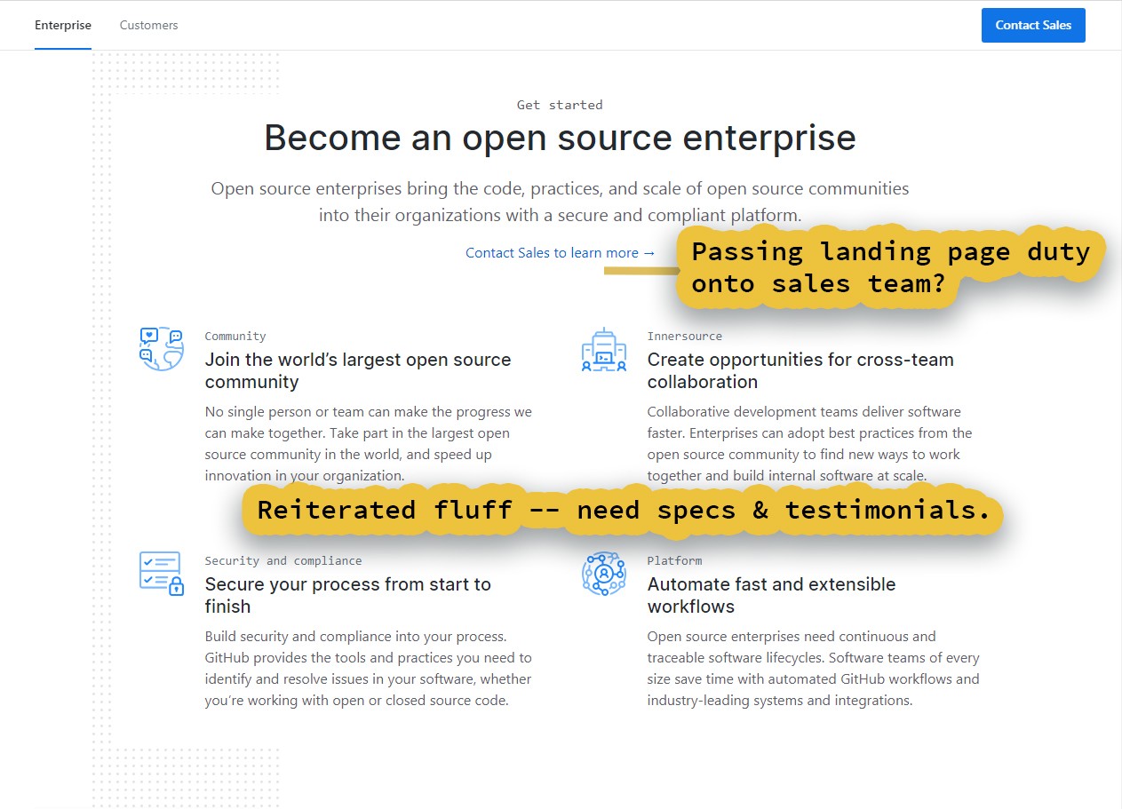
At this point in the page scroll, the average customer has mentally checked-out. They are either going to scroll passed these paragraphs or navigate away and it is not hard to see why. The content is very 'info-dumpy' and jargon-heavy, but without the specificity to capture client needs.
What are the client needs in SaaS (Software as a Service)?
- ☑ A Demo of concrete features and tools (ideally video and a live app PaaS preview).
- ☑ Testimonials of profit and productivity (also ideally video).
- ☑ Then close with a sales contact and payment options.
It is a roughly linear process and it works (more on this in Part 2 below).
Testimonial Issues:
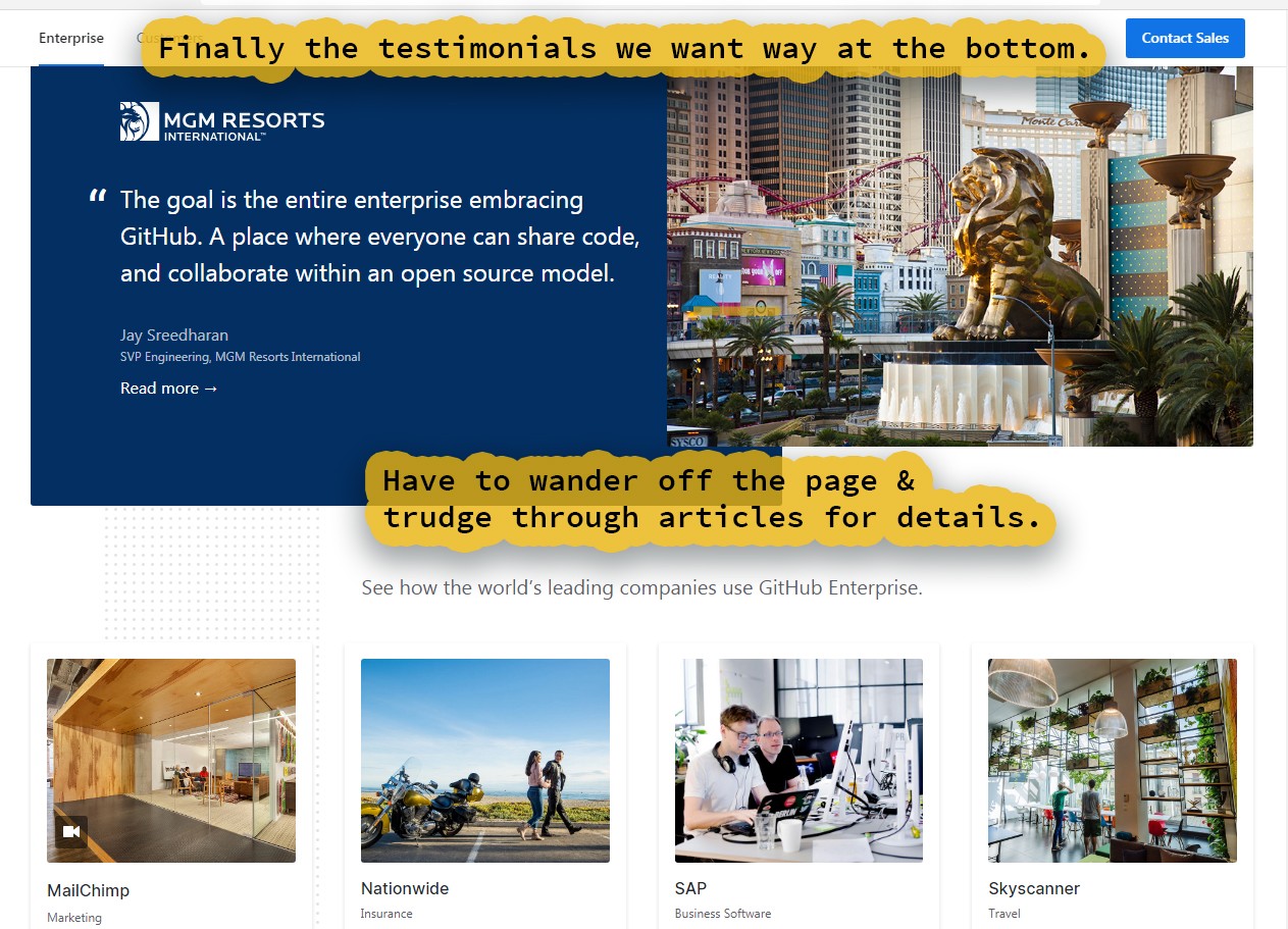
For brevity I skipped over some paragraphs on vague features and mediocre looking business graphics. Presentation and quality in marketing materials matters. There is also some floating circles with tool logos on them, (which is nice) but there are much better ways to present these tools, and ideally, much sooner.
The customer should have these testimonials at their fingertips as soon as they are weighing features. Most readers do not finish the novels they purchase. Newspaper and magazine sales have collapsed. What secret has GitHub unearthed?
Twitter-length blog posts have their place, but this is sales. Software sales, the 'future of enterprise innovation'. Design and UX should be leveraged to the hilt (and they are in Part 2 below).
Article Issues:
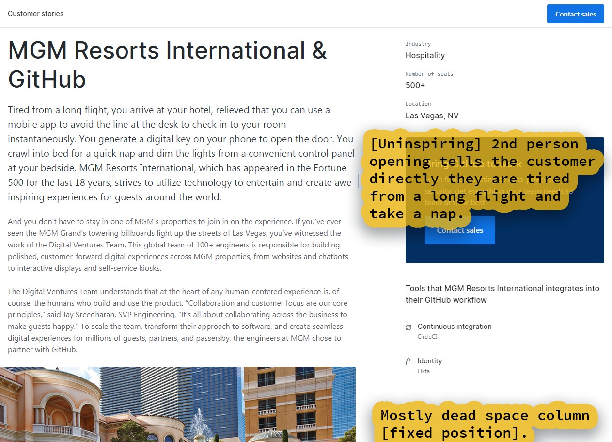
▼Yawns are contagious and so is disinterest.
If you bore someone about your flight and nap, expect a boring response. Sales are impulsive. Impulse, meaning action, emotion, and movement. Words charge impulse.
And words themselves are magic, mentally transporting experiences across time and space. Each syllable has the ability to hinder as a stone or raise-up as a step. Let us rewrite this opening as if a billion dollar company's enterprise sales depend upon it. That means it is going to be something both furious and fun. It has to be.
▼ Excerpt rewrite:
=================
The lion stalks you. Even in the night you feel its eyes, driving you to seek shelter. The shelter of a glass palace. This is Vegas baby and that lion is massive and made of gold. Welcome to MGM Resorts International where you are the VIP -- cutting through crowds -- and using the latest in mobile tech to check-in and unlock your suite. They have been Fortune 500 for the last 18 years, and now with GitHub Enterprise, they are forging hundreds of guests's fortunes.
Is 'baby' sexist now even though it is relevant Elvis-speak and still in every song, film, and entertainment medium? If so, we just swap and thesaurus through (like bandito, roughneck, or roughrider).
▼ This structure communicates:
- ☑ A hook (mysterious lion stalking you and danger).
- ☑ Brand value (glass palace and massive, gold lion).
- ☑ Customer value (you are the VIP and guests's fortunes).
- ☑ GitHub Enterprise is a part of all this value.
A little memorable word-play also goes a long way and is great to end on.
PART 2, Market Strategy:

▼ GitHub, get hugged.
GitHub's vision and mission statement is: "We’re supporting a community where more than 40 million* people learn, share, and work together to build software."
In line with that, every brand could use a tagline to punctuate their persona-grabbing stories and fulfill their vision. Here are a few stories with an example tagline below.
▼ Persona Story I (worker bee, student):
=================
"Three." An eye opens and focuses to a distant muffled voice. "Two." The voice is closer, but still distant. We see the owner of the eye revealed to the top half of their face, tensely rubbing their temples and bathed in the blues of a monitor. "One." This voice is now crisp and pointed, the view panning across a desk-filled room of 50 similar such people. All eagerly hunched over their displays.
"We have touchdown."
And the room erupts. Raised arms and applause. Smiles spreading across as those above on an overlooking deck press together in cheer and triumph.
Behind them, the rusted dunes of Mars passes beneath a mechanized rover, wall-to-wall on screen.
GitHub, get hugged.
▼ Persona Story II (solo-user, early phase start-up):
=================
The door creaks open. Our view low to the ground. And creeping. Creeping towards a woman alone -- alone and unsuspecting at her desk -- typing away.
A small, tentacle-like hand reaches up from the shadows.
"Honey just a sec and let mommy push this so we can 'git' paid." The woman looks down from over her shoulder. There stands a child of four or five, costumed as GitHub's Octocat, and carrying an Octocat doll. The woman turns back and on the screen is the GitHub Desktop app.
SUCCESS: a git push action is displayed going through.
She pulls the child up onto her lap and teasingly plays with his tentacles while tickling him.
GitHub, get hugged.
▼ Persona Story III (executive, biz-class):
=================
A black Bentley snakes the misty streets. The brakes then squeak as it groans to a stop. Out steps a suited man: executive attire with Rolex. The door shuts swift -- HARD -- and the driver slinks away. He's left a lone figure, the airport near-vacant this time of night, his shoes clacking the pave as he walks.
The man looks to the right. And then to the left. Anxious. Anxiously pressing phone to face.
"They're really after me." He loosens his tie, swallowing hard. "Things are falling apart.... I'm out of options."
"No problem. Everything should be up on our servers and ready to-go later tonight. Enjoy your vacation." A GitHub rep responds, the blink of server rack vignetting them.
Relieved, the man steps into the warm glows of the interior. There his wife and child, decked-out in tropical tourist attire and standing next to luggage, embrace him.
GitHub, get hugged.
▼ Tagline & stories satisfy key user needs:
- ☑ Imposter Syndrome.
- ☑ Community building.
- ☑ Tech support.
- ☑ Workplace survival & success.
Now that we have recapped to better understand and communicate the mission statement, it is time to tackle GitHub Enterprise's branding and tagline.
PaaS Branding:

▼ Enterprise = GitHub+
With Enterprise we want as many warm potential customers for further marketing. To do that we need to market to 40 million GitHub users, but without being invasive or annoying them (cooling towards brand).
▼ Why market to GitHub users?
- ☑ Fans of the GitHub brand (warm customers).
- ☑ They can be educated to inform (warm-up) management and generate leads.
- ☑ Scaling tiered features for small teams or individuals.
- ☑ Community building (a necessity for viral marketing, sharing, and adoption).
- ☑ Data, analytics, and feedback (the new oil) for tuning features and price.
Data in particular is paramount to feed all of our Machine Learning tools and services as we transition from social media and collaboration in information age and into an era of automation. You will not be able to maintain or develop a competitive edge in the future if you are not constantly compiling and labeling mountains of data. Relevant use cases include: preconfiguring and deploying DevOps architecture, tighter product fits, user-profiled marketing and sales, tool niche identification, and marketplace gap closure.
But how do we overcome the obstacle of annoying users and cooling them towards the brand?
Enterprise = GitHub+.
Or more specifically, organization and encapsulation. Enterprise is like GitHub, but includes commercial and team-oriented tooling, as well as informative lead magnets (like business blogs, articles, and social media commentary found on LinkedIn). Here is a UX study on LinkedIn news, making LinkedIn more like LinkedIn. Ideally these strategies should also be deployed within a GitHub marketplace.
Most importantly, all these services will be tucked away neatly under one enterprise icon next to the GitHub icon. Plus, it also features alerts and notifications (like for credit usage). Users shall be able to customize their GitHub homepage to classic or Enterprise (when logged in).
In summary, we want to position Enterprise in the market as...
▼ Enterprise positioning:
- ☑ For: teams, enterprises, and the business-minded.
- ☑ Who: are interested in business or software development.
- ☑ To: provide one-stop DevOps with hosting, unified via an exceptional UX, and to educate others on the impact of tech.
- ☑ Unlike: juggling resources in a bogged-down infrastructure or using confusing and cluttered toolchains. This diminishes your ROI (Return on Investment) while neglecting the KPIs (Key Performance Indicators), resulting in foggy expectations with uncertain results.
- ☑ GitHub Enterprise is a scalable, Enterprise growing ecosystem or PaaS.
Now with all of this in mind we can design the logo.
▼ Enterprise logo requirements:
- ☑ GitHub+: like GitHub but '+' or more (like a 3Dish Octocat head is 'next-gen graphics').
- ☑ 'Enterprise'-like: tech that needs infrastructure support (rocket).
- ☑ Looks good as a 32 x 32 pixel icon.
- ☑ Fun, exciting, growth (smiling, rocket launches, eyes with the head pointing skyward).
For a first pass, I think we succeeded with the Enterprise logo. Sadly, all rocket icons tend to read as some sort of pen or brush at a small size. To get around this, the icon features an easily readable wrench instead (wrench = tools).
▼ Enterprise tagline:
For the tagline we want something that communicates the excitement and support of launching a rocket. It also has to be easily adapted to buttons, headers, components, and featured in business speak.
You might already have a business, or play a role on a budding team, but with GitHub Enterprise you become part of a support staff and infrastructure. Much like NASA or SpaceX, we take wherever you are now, strap on an Enterprise-class rocket, and launch you further than ever before.
Launch your Enterprise.
We have now defined and articulated Enterprise's positioning, brand, and tagline ('launch your Enterprise'). We are ready to begin redesigning the landing page to warm-up and convert customers.
Landing Page:
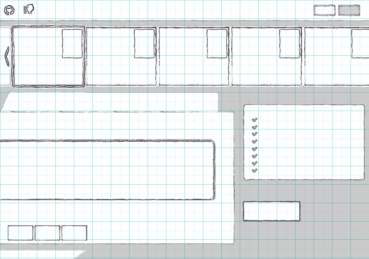
▼ Logo-based Sketch.
With the logos complete, layout components are sketched-in and placed. Here is a carousel with a gallery. From here we further define and nail-down the UX in the next step.
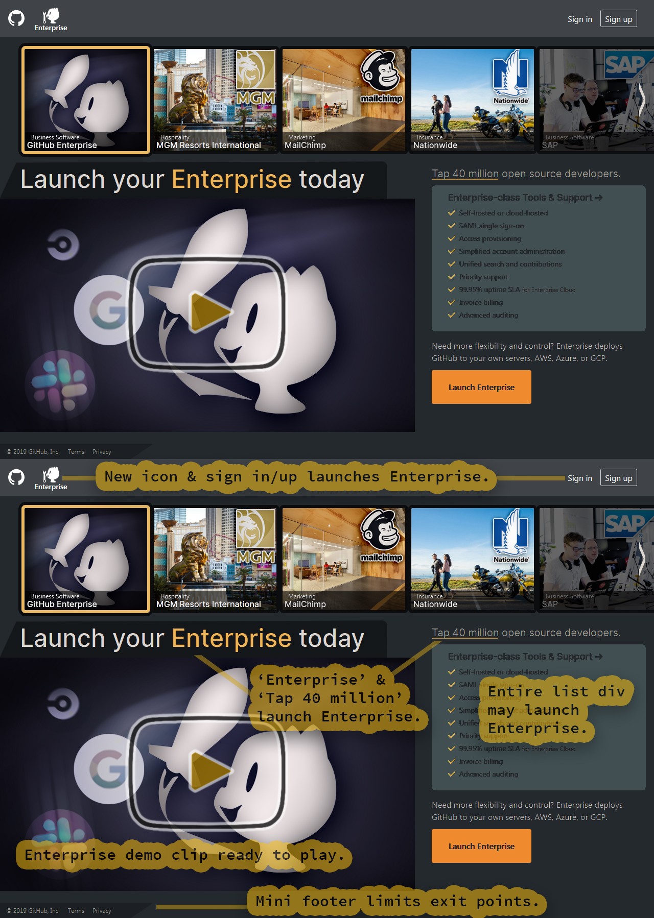
▼ Focus is a Funnel.
We need a landing page purpose, this purpose is our signal or call out into the wilds.
Purpose: to launch your enterprise (by integrating with our PaaS ecosystem). Ideally, we have some freebie or scalable features that are light on storage and cost (like a Kanban board and scheduler). This allows us to actively engage users and hook-in to gather further analytics.
Eliminate waste: amplify and direct towards our purpose by eliminating what is not needed, limiting the cognitive load and stress level. In Lean or Agile this is waste, in marketing or communication this is noise. Noise confuses and cancels out our signal (or purpose) to users.
Maximize entry points and minimize exit points: typically this deals with links. We do not want to trick the user or make them feel railroaded, but instead customize the launch page with #hash configurations as needed. Once the user launches Enterprise or 'activates' it with their GitHub sign-in, they will then be greeted with a customizable homepage of blog articles and begin integrating with various PaaS services.
Singularity: Single Page Applications or SPAs are great, but what about Minimal-Scroll Applications? Scrolling can easily trigger disengagement and search anxiety from decades of disappointing apps. We want to stand-out here and serve-up a platter instead of a rat maze.
Dark theme: knowing video is the centerpiece, I went with a dark theme. Video and entertainment media is much more vibrant on a darker background, and we humans also have the cultural experience of the theatre. Software developers and professional tool users generally prefer gray-based dark themes as well.
Reliable UX patterns and design: the video play button is based off of Youtube, the leading videos site that has trained billions of what to expect. Our carousel works like a simplified Netflix and Amazon Prime Video slider, which has trained many millions of customers. A unidirectional data flow from top-to-bottom and left-to-right, enhances communication and navigation (learned from decades of reading).
NOTE: 'FREE' rarely feels 'FREE'. Human psychology understands that there is something often lurking beneath the 'FREE' exchange. When the customer is left to create what 'FREE' means, you then lose both the focus and control of the story (or sales conversation). Instead, we only tell them something is 'FREE' at the very moment a payment is required. This causes 'FREE' to operate as relief or a bonus instead of a 'Buyer Beware' sign.
Gallery:
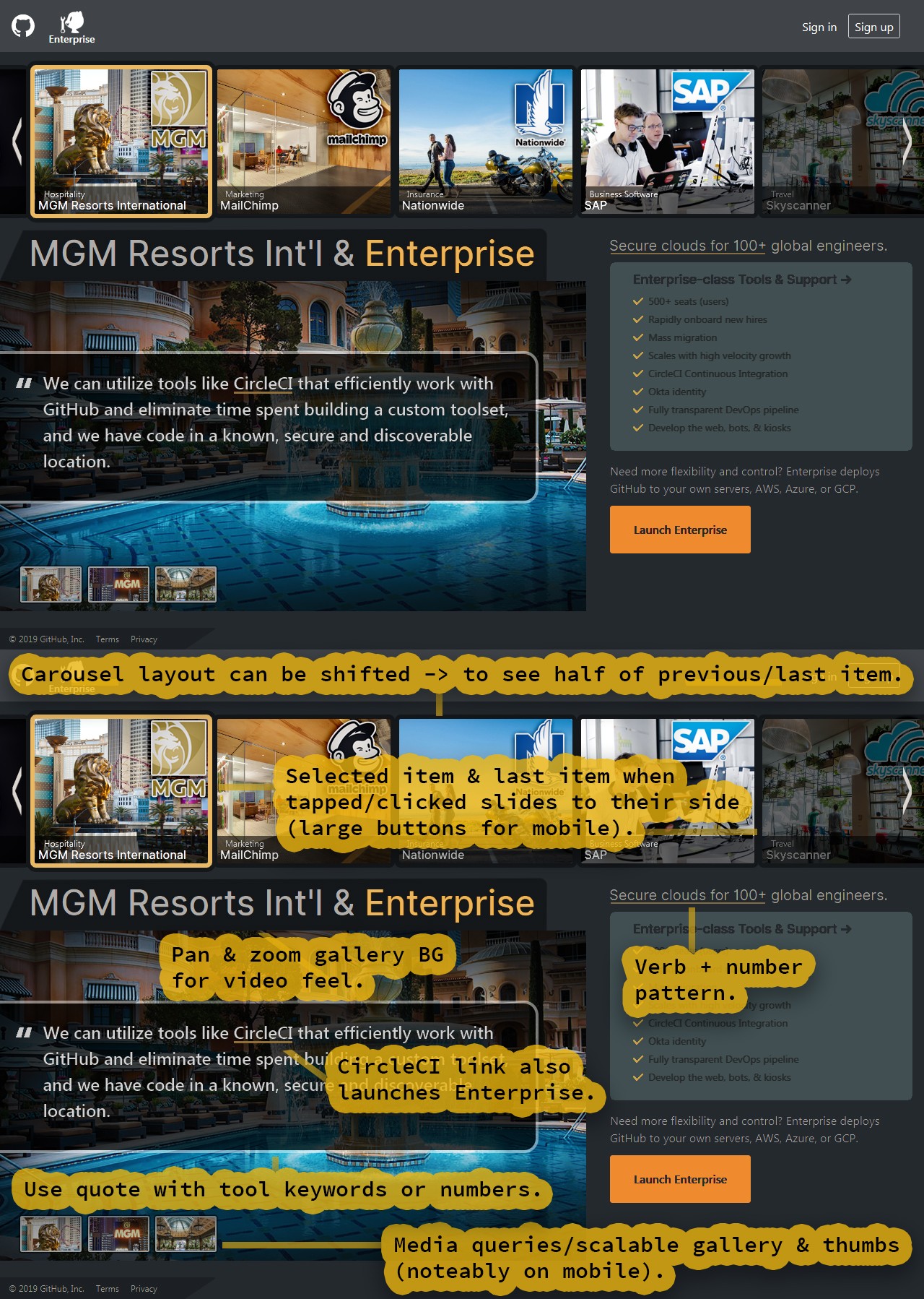
▼ Robust UX
Video and motion graphics: in an ideal world we have tight and tuned promo videos for all of the testimonial content. A lot of these can be generated from photos and the articles using motion graphics accompanied by narration (After Effects and Cinema 4D with Resolve and Fusion pipeline). However, due to the time and cost generating media (or user technical issues like bandwidth) we can replicate a motion graphics and video feel using panning and zooming images and a gallery carousel.
This makes the first priority the carousel (component). That carousel is then followed by a GitHub Enterprise feature video. NOTE: both can be worked on in parallel, sharing data and assets.
Gallery: an easy component to engineer using React-Spring or another JavaScript animation API or UX library. It is also fairly simple to port elsewhere or to mobile. NOTE: this component swaps the current displayed image with the gallery thumbnail on click (that means there is no thumbnail for the selected image).
Triangles: the triangle edges, play button, and minimal footer can be either SVG aligned with divs or CSS styled divs entirely.
Data hydration: can be addressed with GraphQL in the place of REST since the queries use precise start and end points. This not only breaks-up payloads, but allows more queries, keeping your data much more 'wet' or updated (data hydration). Prisma ↗ is a great GraphQL API for delivering an ORM-like abstraction (Object Relational Mapping). It provides proxy bindings for various databases and has a default schema ready for use with CRUD functions (Create Read Update Delete).
Like this post? Read more from the ^UX topic.

Docker vs Kubernetes
